
RemainCo., Ltd
- Unified Style Guide for Designers
Overview
At a web agency, It’s essential to handle multiple tasks on a tight schedule. This project established a unified style guide to ensure consistent work across all projects.
contribution
I was charged in a lead designer on the project. To improve working efficiency, I proposed and led the creation of a unified component file in Sketch App — building a reusable component structure with the team.

Initial Thought

pain point
01
Deadline was always too tight.
02
There’re several repeated components on projects.
03
Communicating with software engineers was essential.
what we Have?
Since we’ve run a creative academy, we had an educational system study document.
- All of the team members were aware of this documents.
- The document was a theoretical document, so It had not been used in a practical way ever.
Step 00. Foundation
THE APPROACH
To address the pain points of inconsistent interfaces and inefficient team workflow, we adopted a token-based design system approach.
- All designers could work with the same predefined values, eliminating inconsistencies.
- Developers could easily translate design specs into a reusable UI component library.
- The team could scale design output without sacrificing quality or coherence.
idea
Element
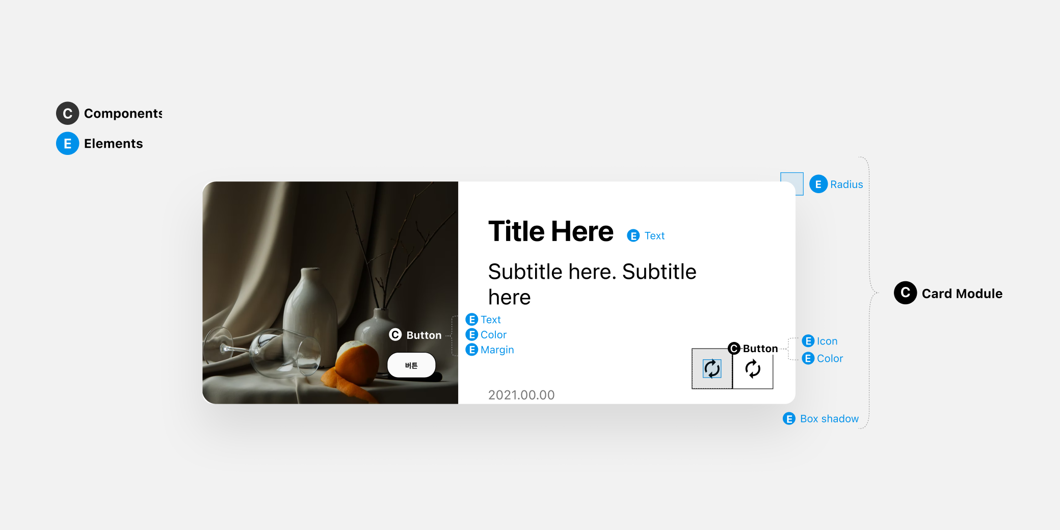
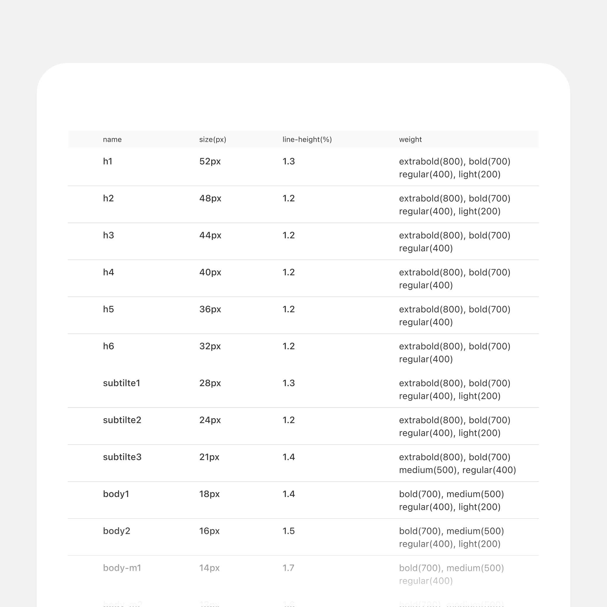
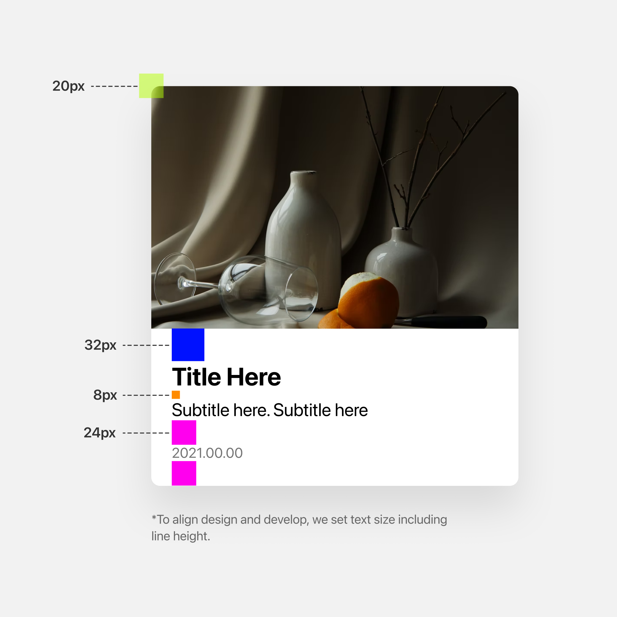
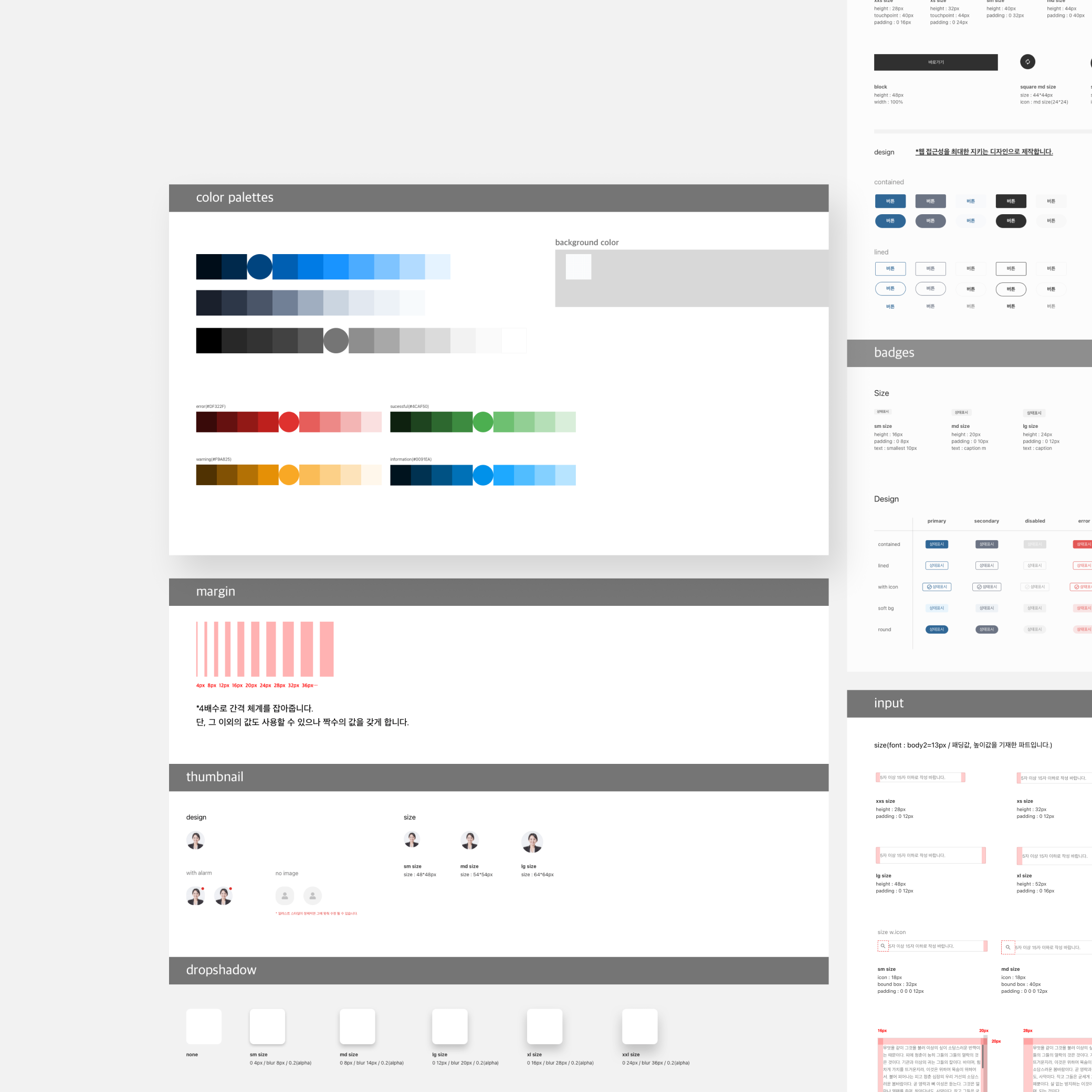
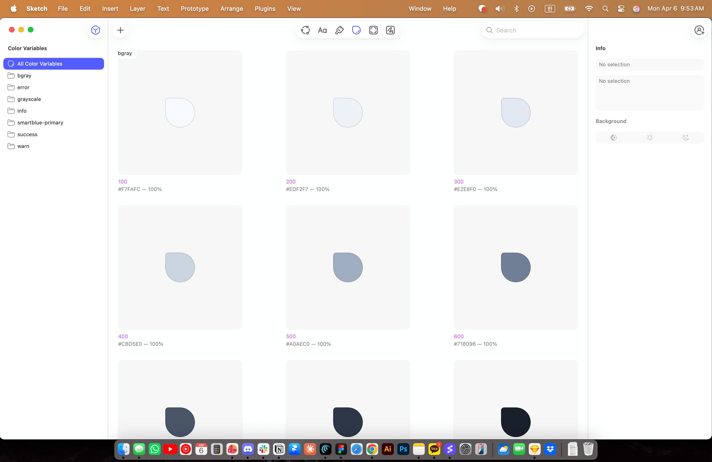
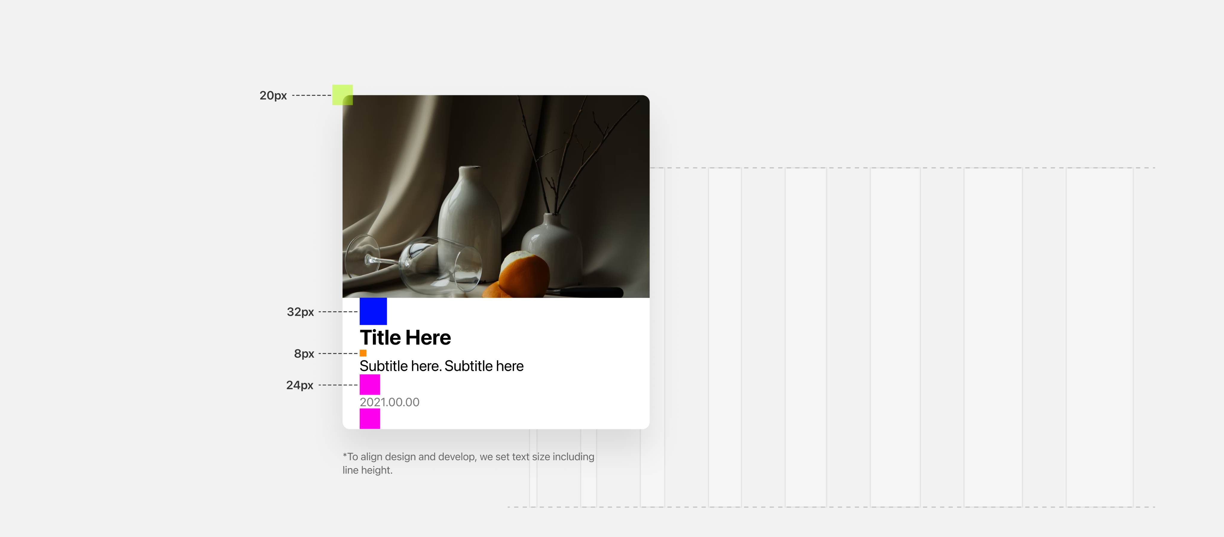
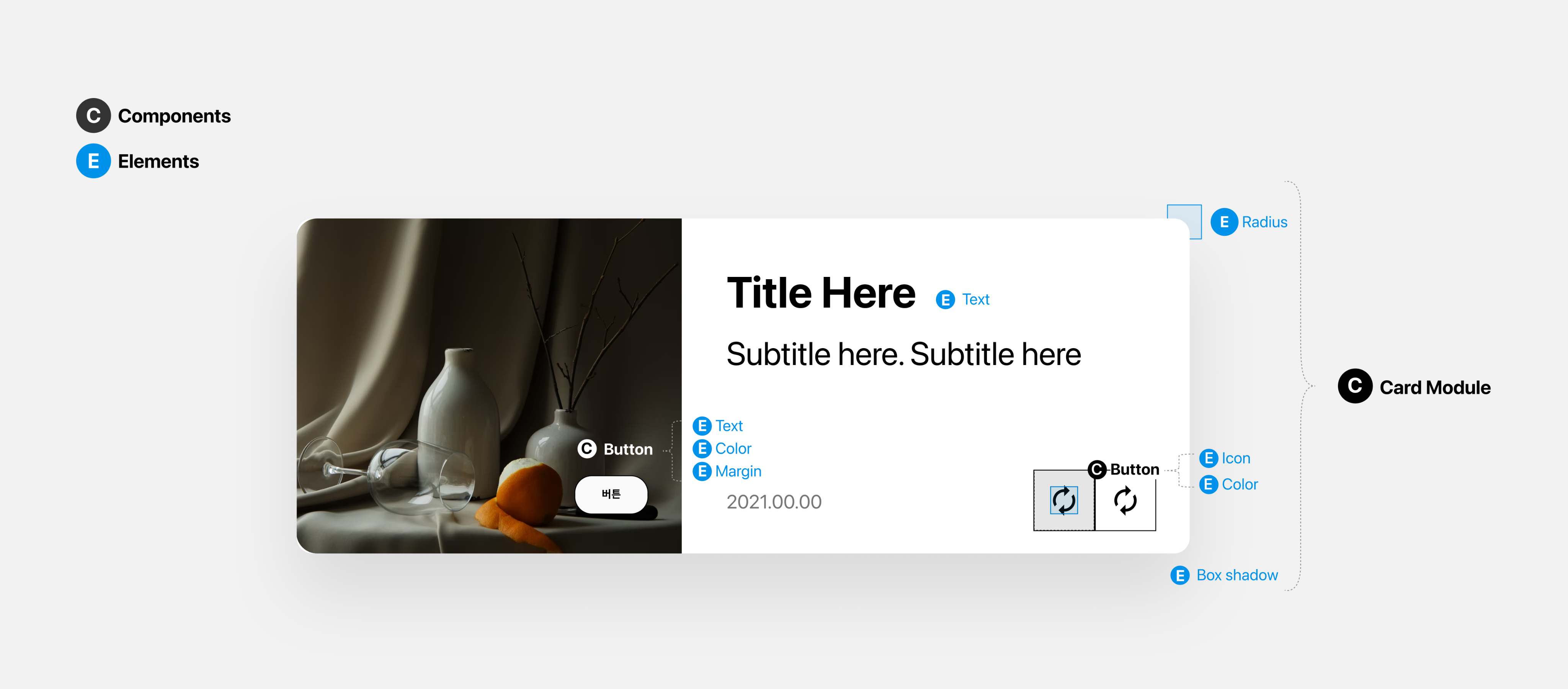
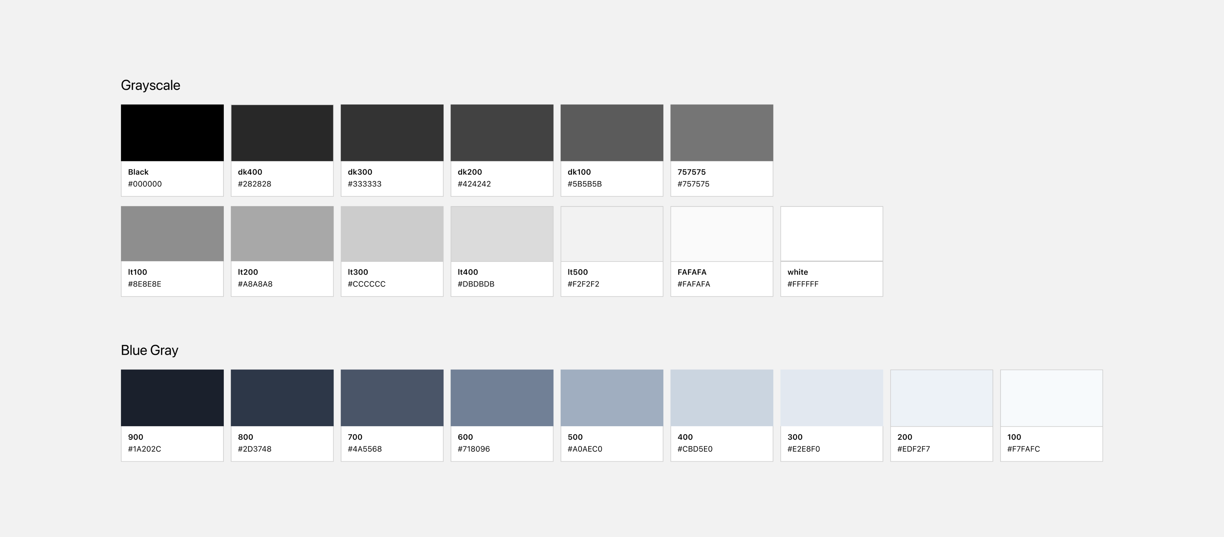
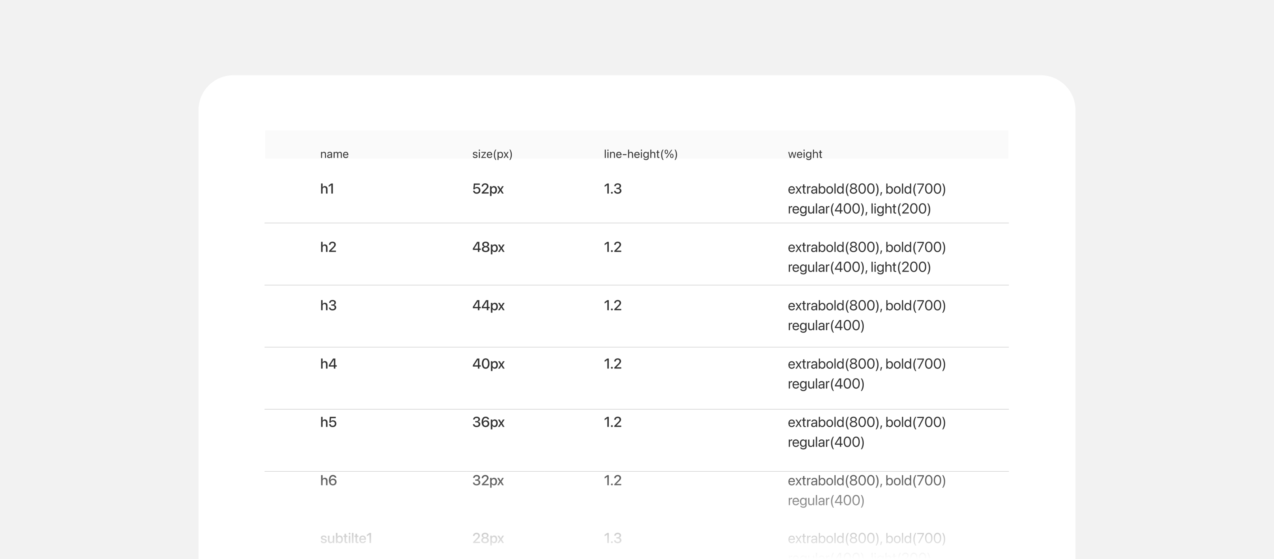
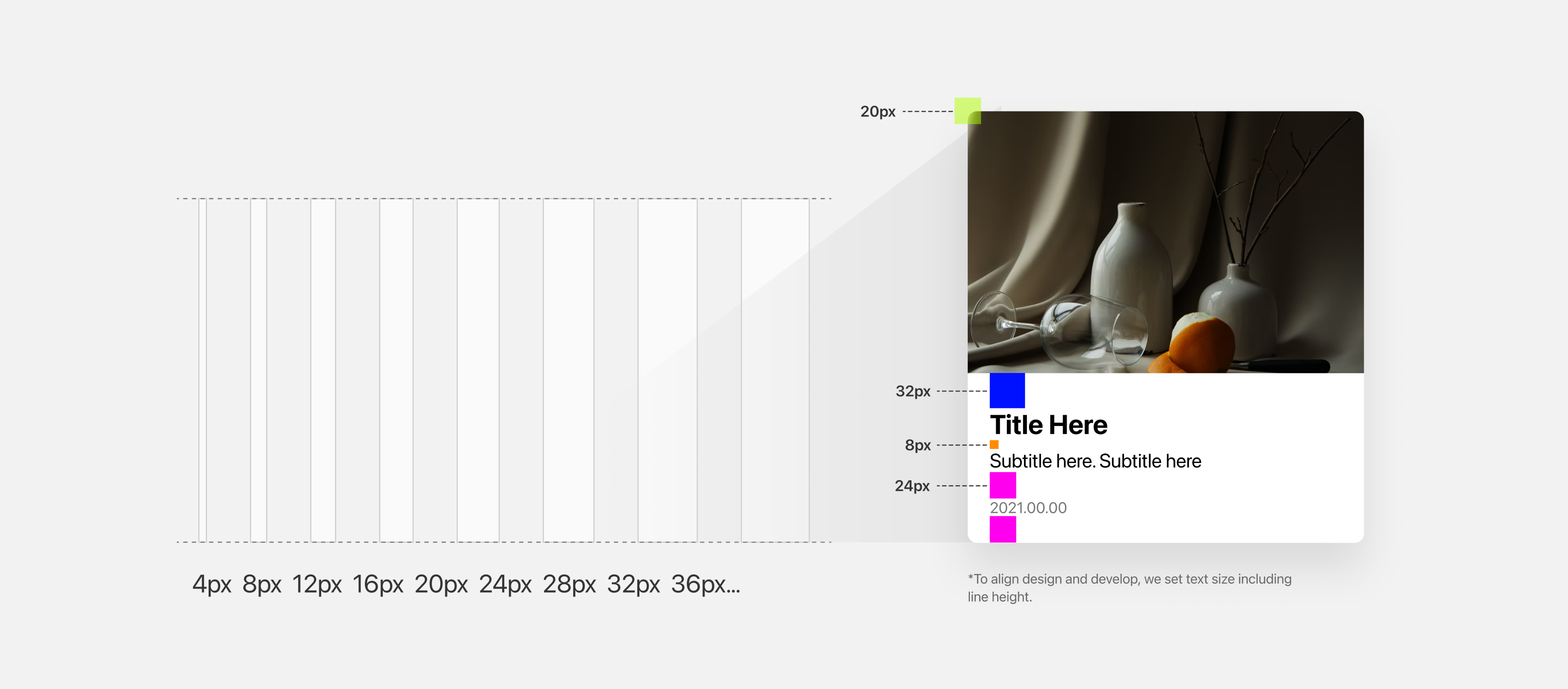
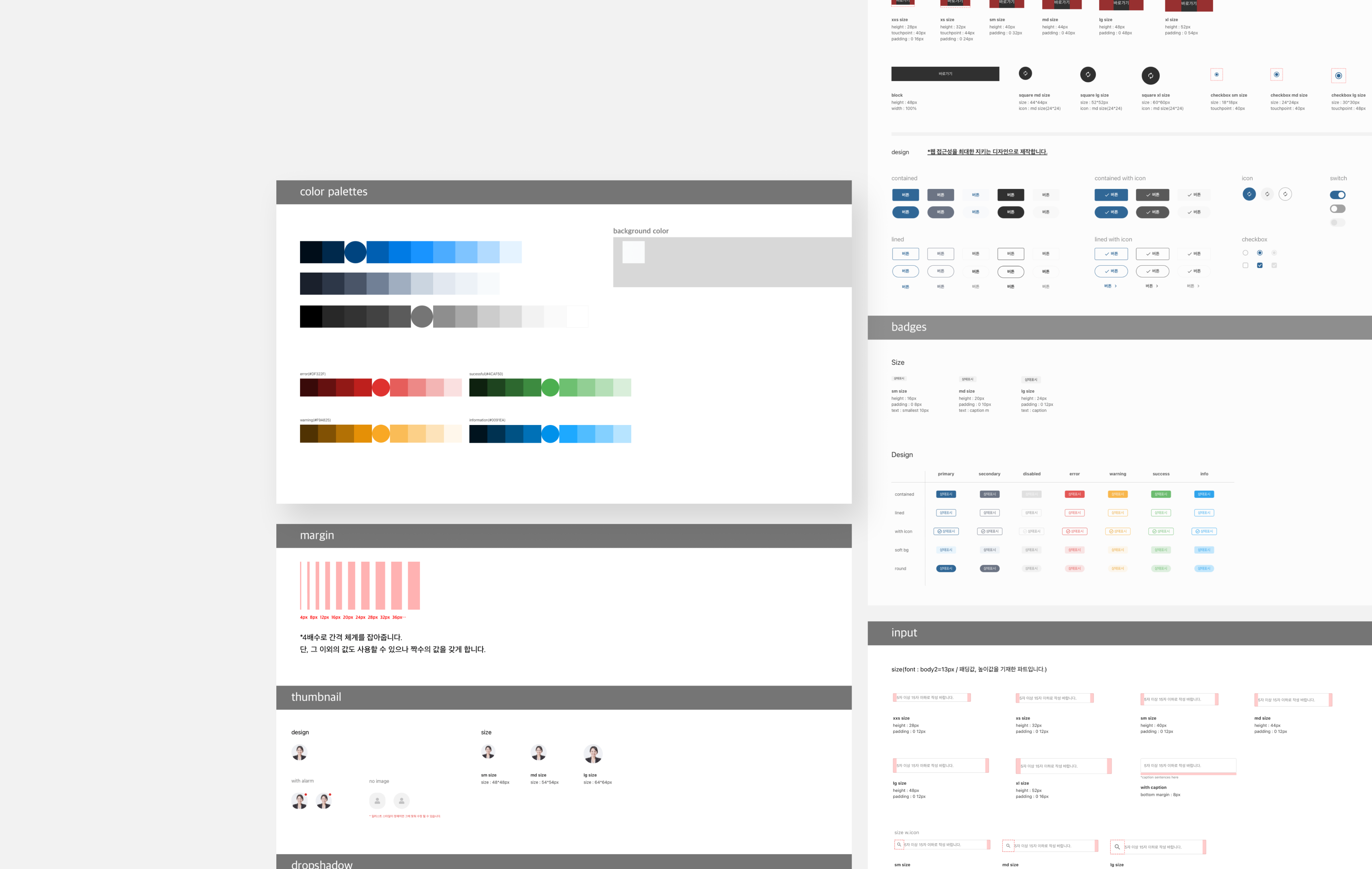
Element is the smallest atomic unit to build a page such as Font, Color, and Spacing. Think of it as preparing the basic ingredients before cooking.
Component
Component is a module built by combining two or more elements. Just as ingredients come together to create a dish, elements combine to form reusable interface components that the entire team can rely on.
Step 01. Element

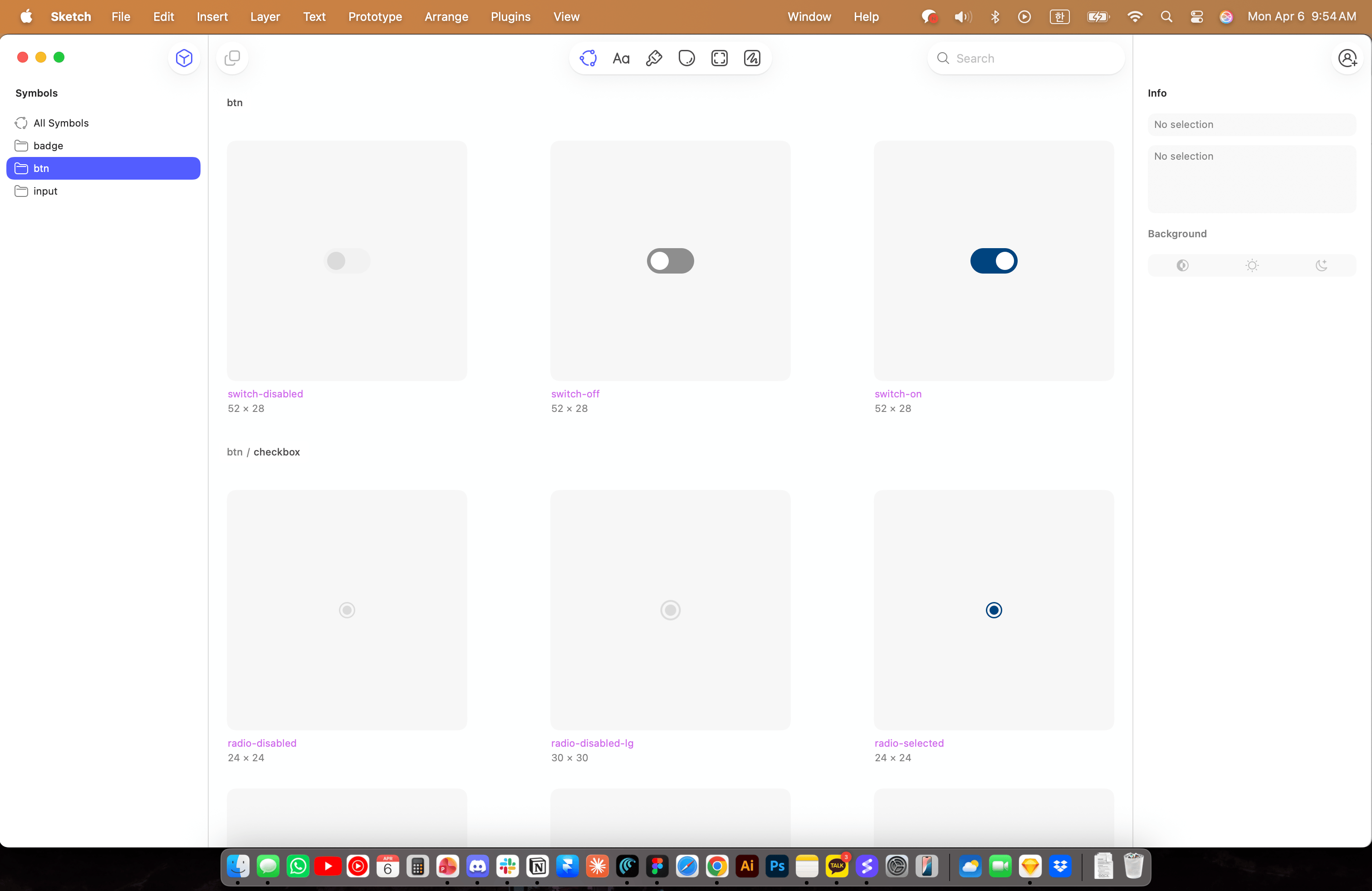
Step 02. Component
what components
we’ve set?
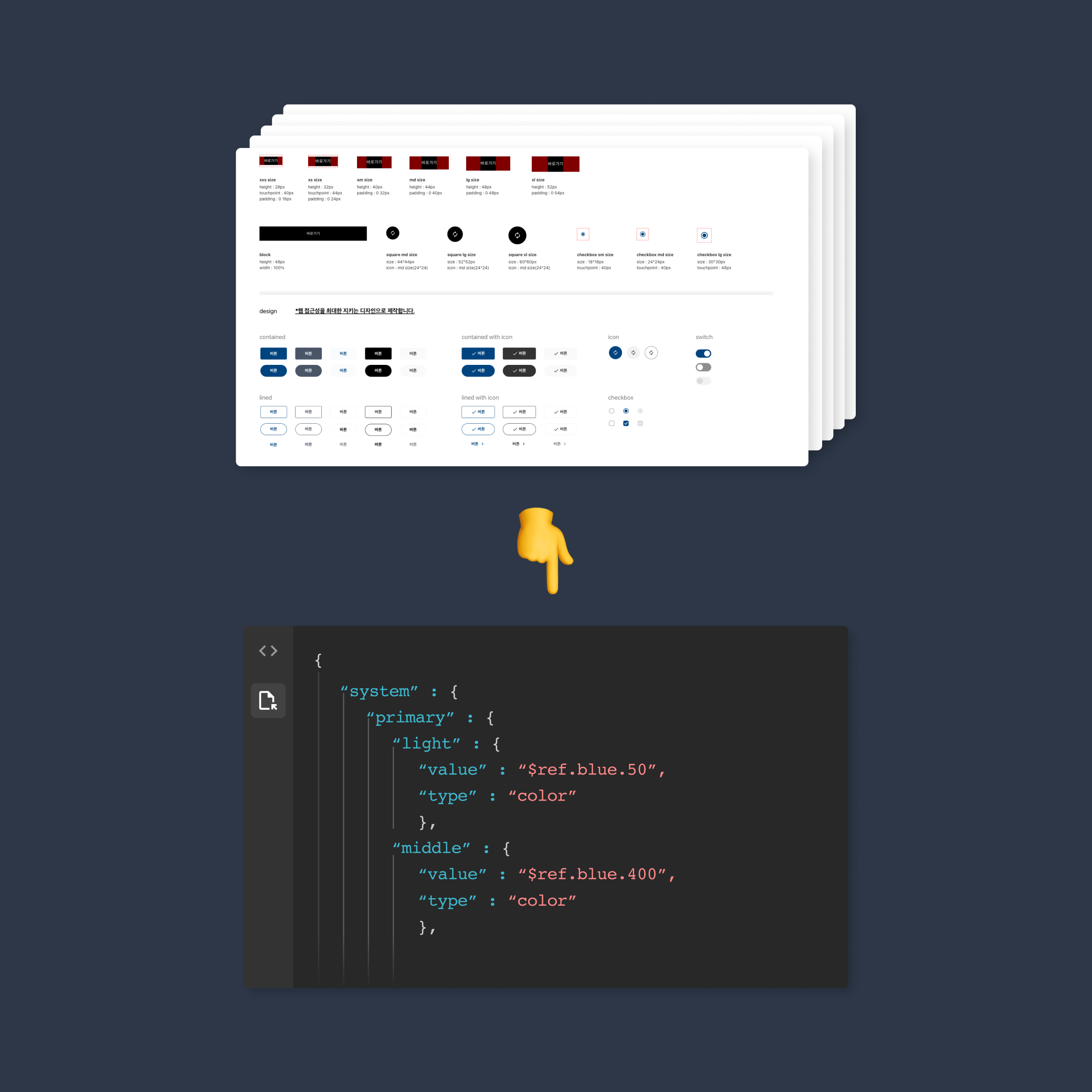
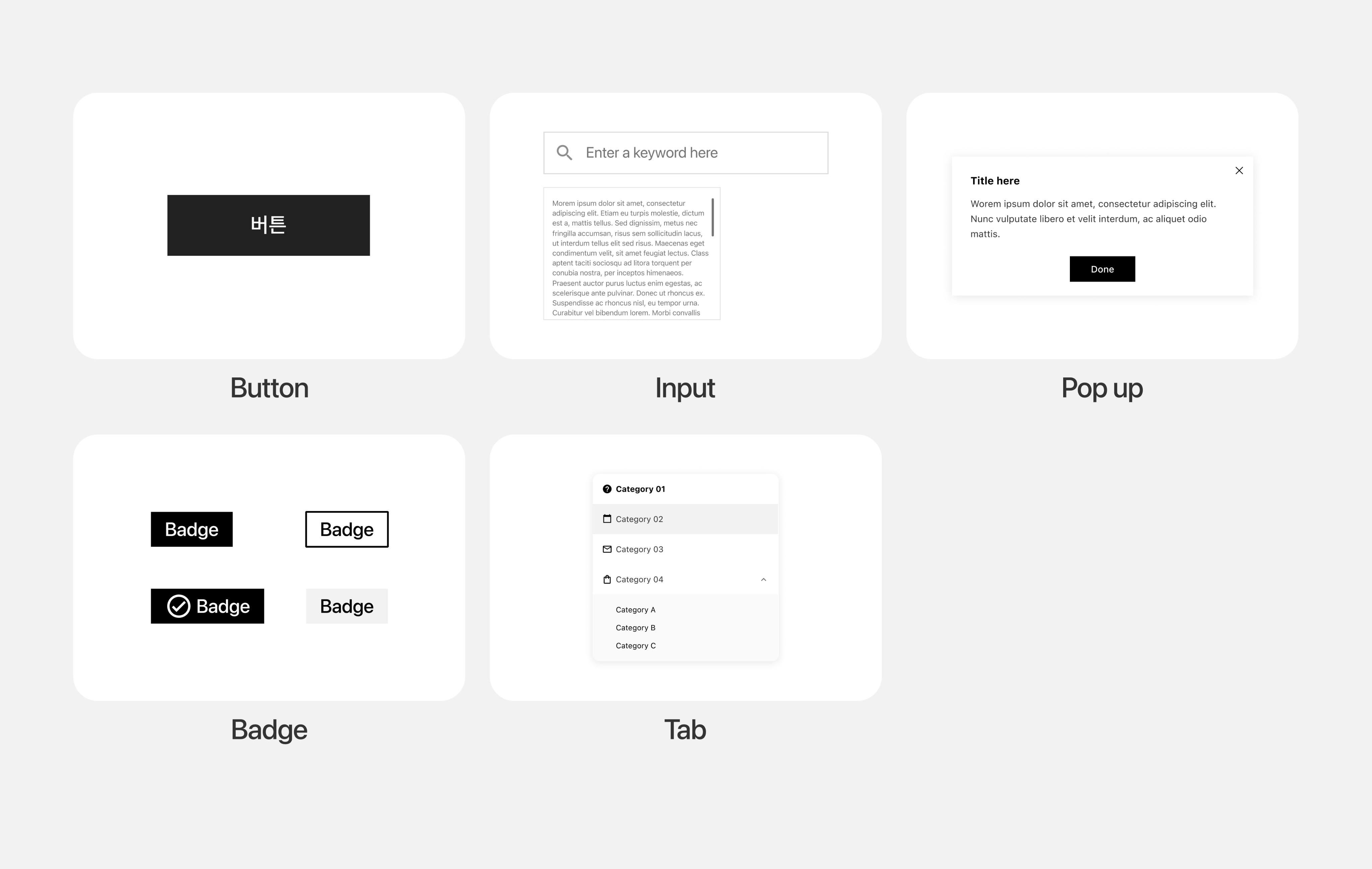
We built the component library by selecting recurring interface elements from previous project and consolidating them into a reusable shared framework.

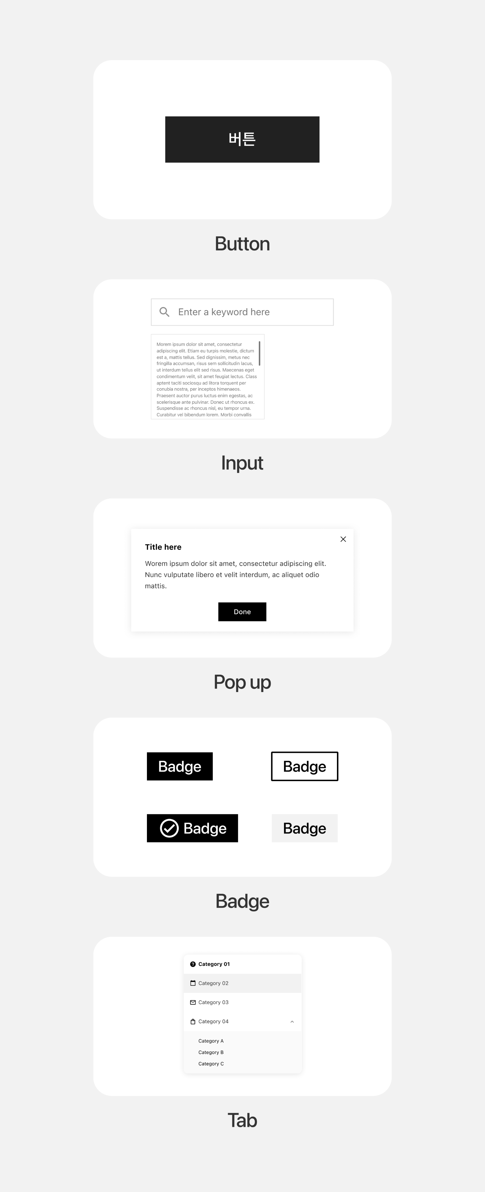
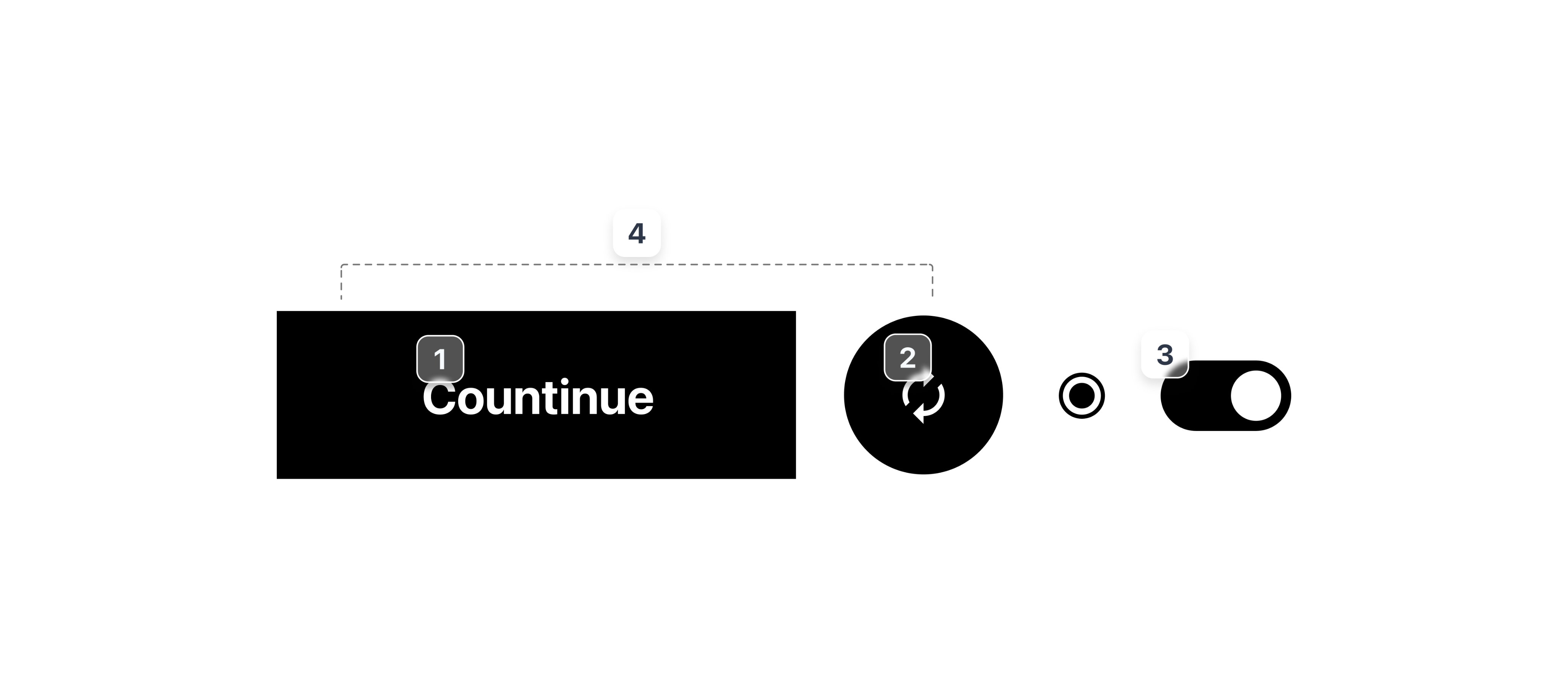
button
We distilled the 3 most common button patterns from past work into reusable CTA-focused components, built with Sketch symbols and layer styles for quick project adaptation.
badge
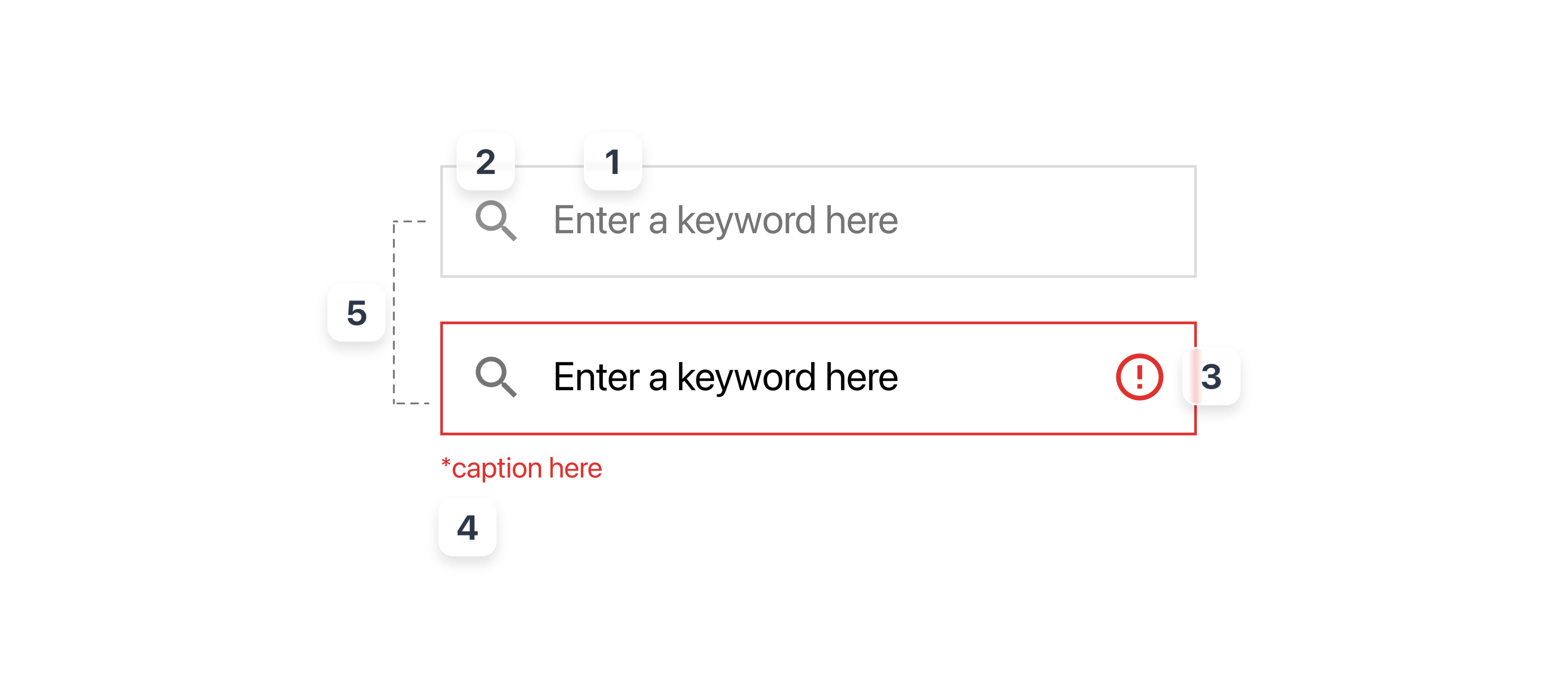
Input was also the most important and common interface in a service. We built a flexible input system covering diverse data entry scenarios, structured with Sketch symbols and layer styles for quick adaptation and consistent styling across projects.
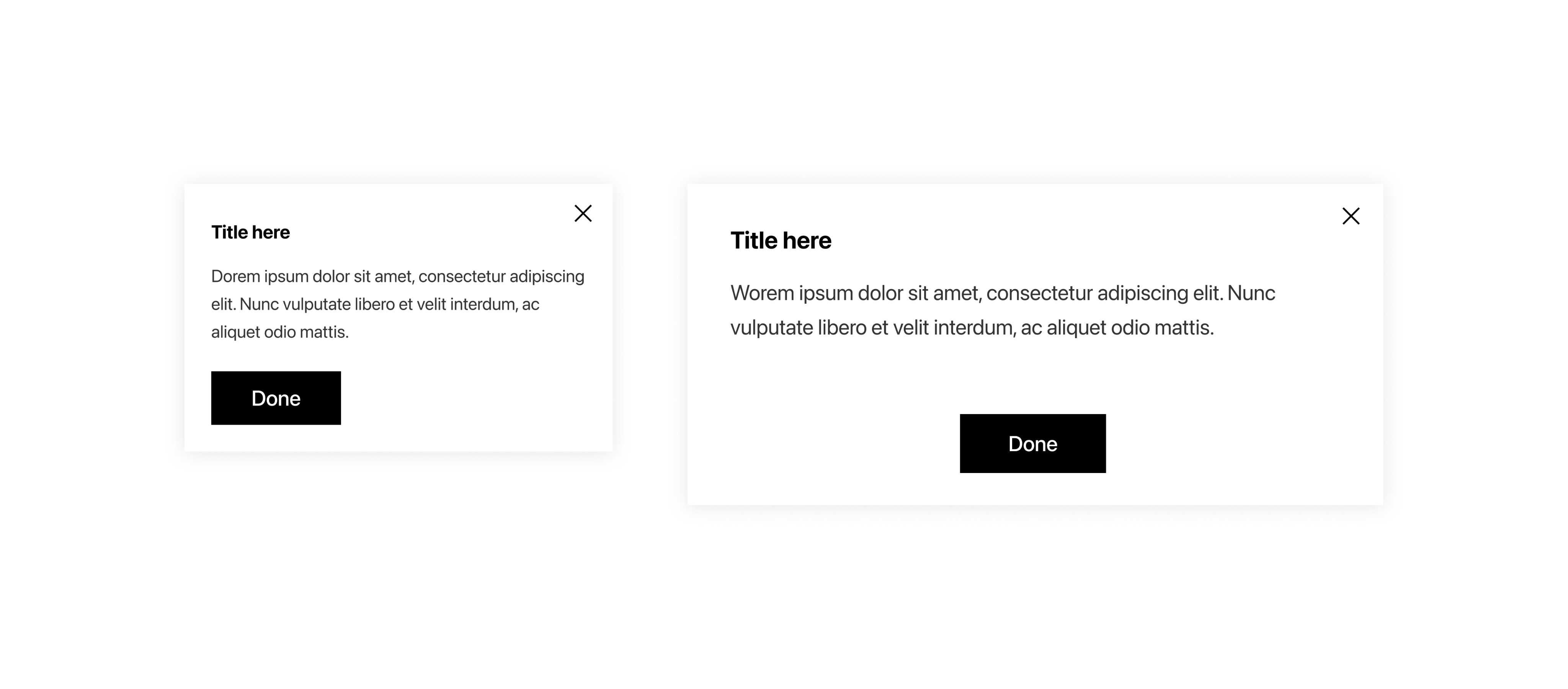
pop up
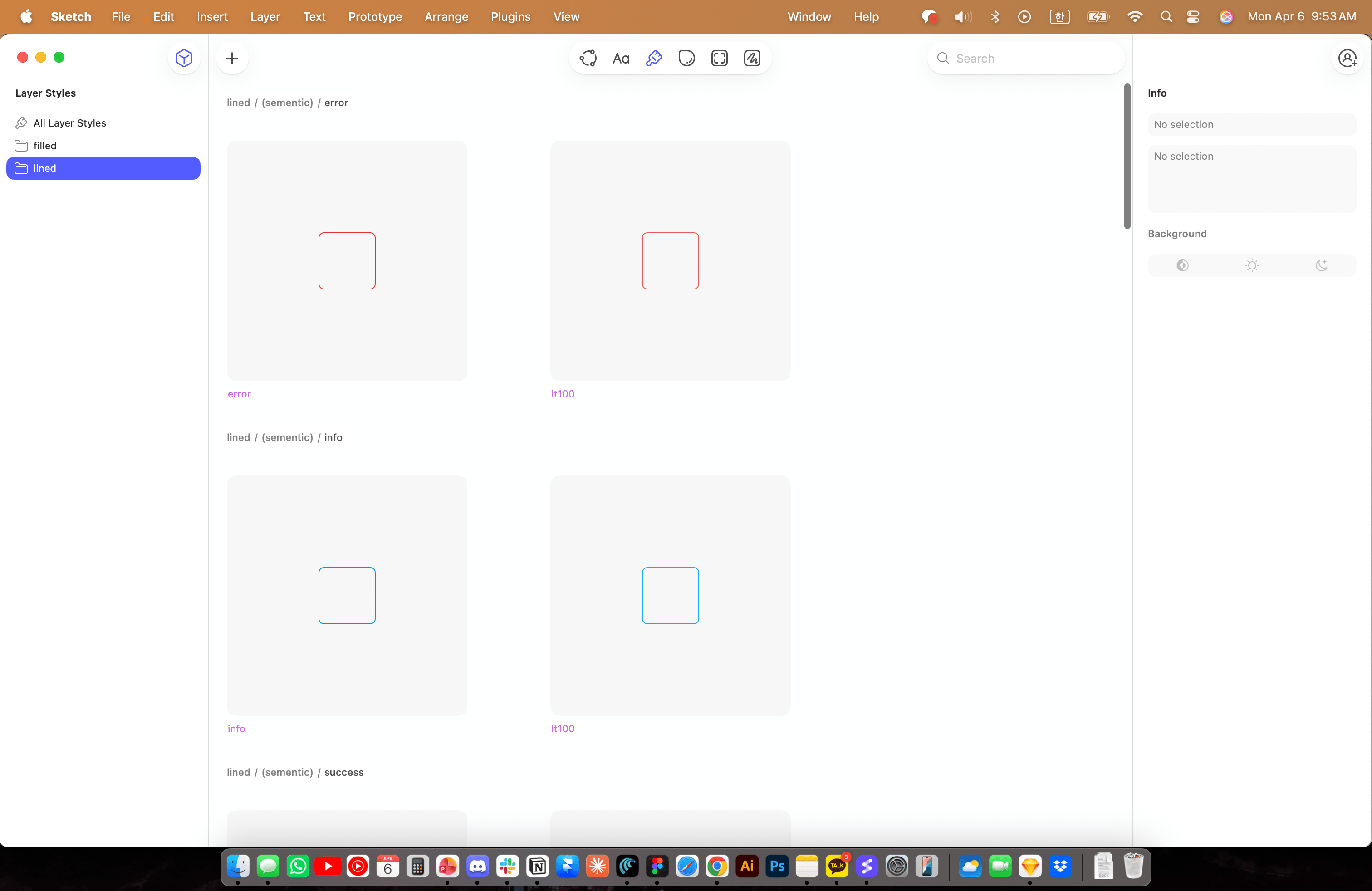
Pop-up has a specific behavior, modality. It’s delivering crucial and highlighted messages for users. The point of Pop up is stacked on Z-axis, to be distinguished to a page that comes from.
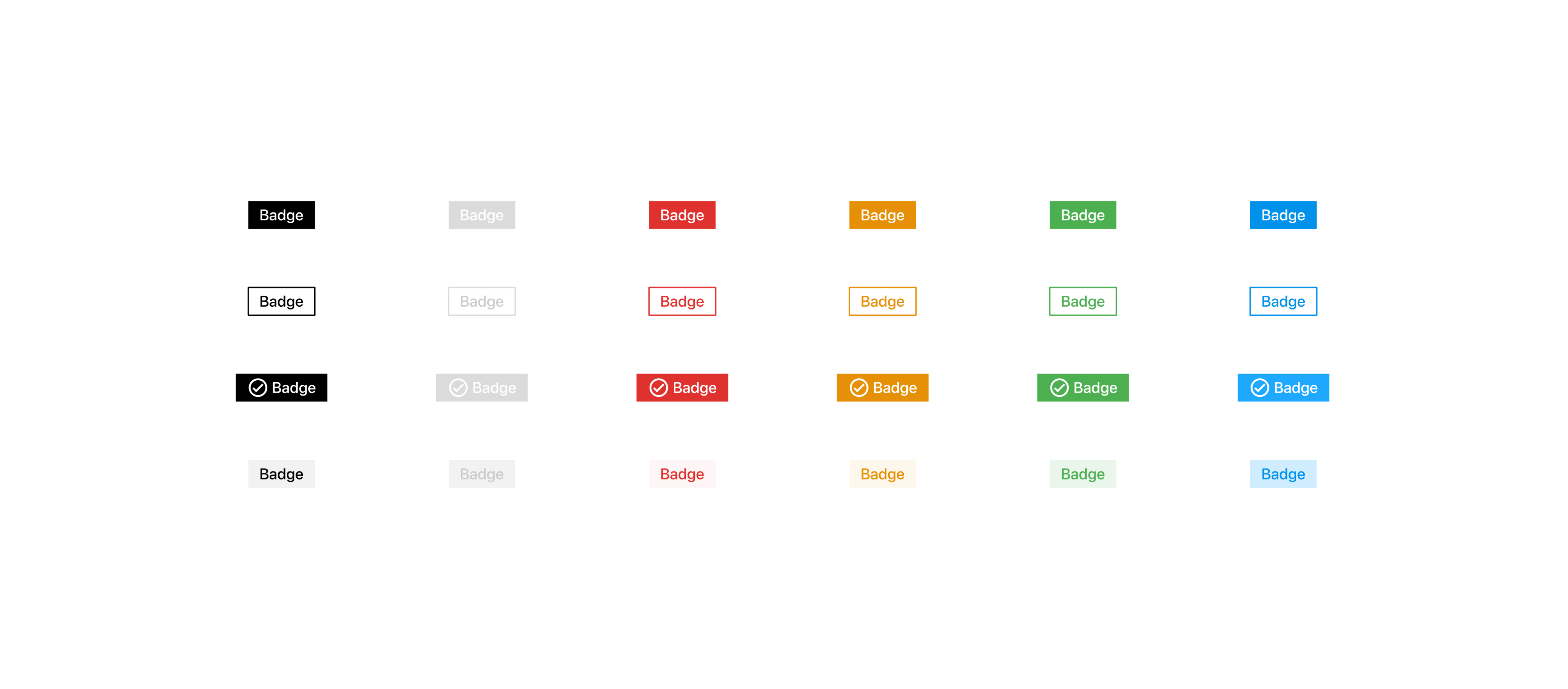
badge
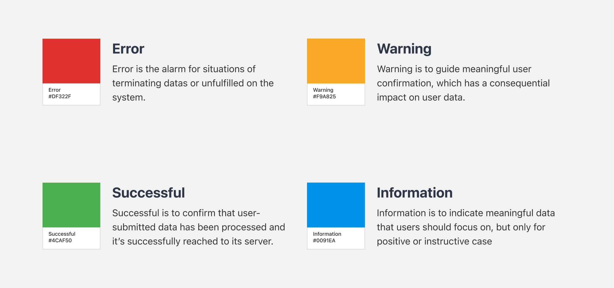
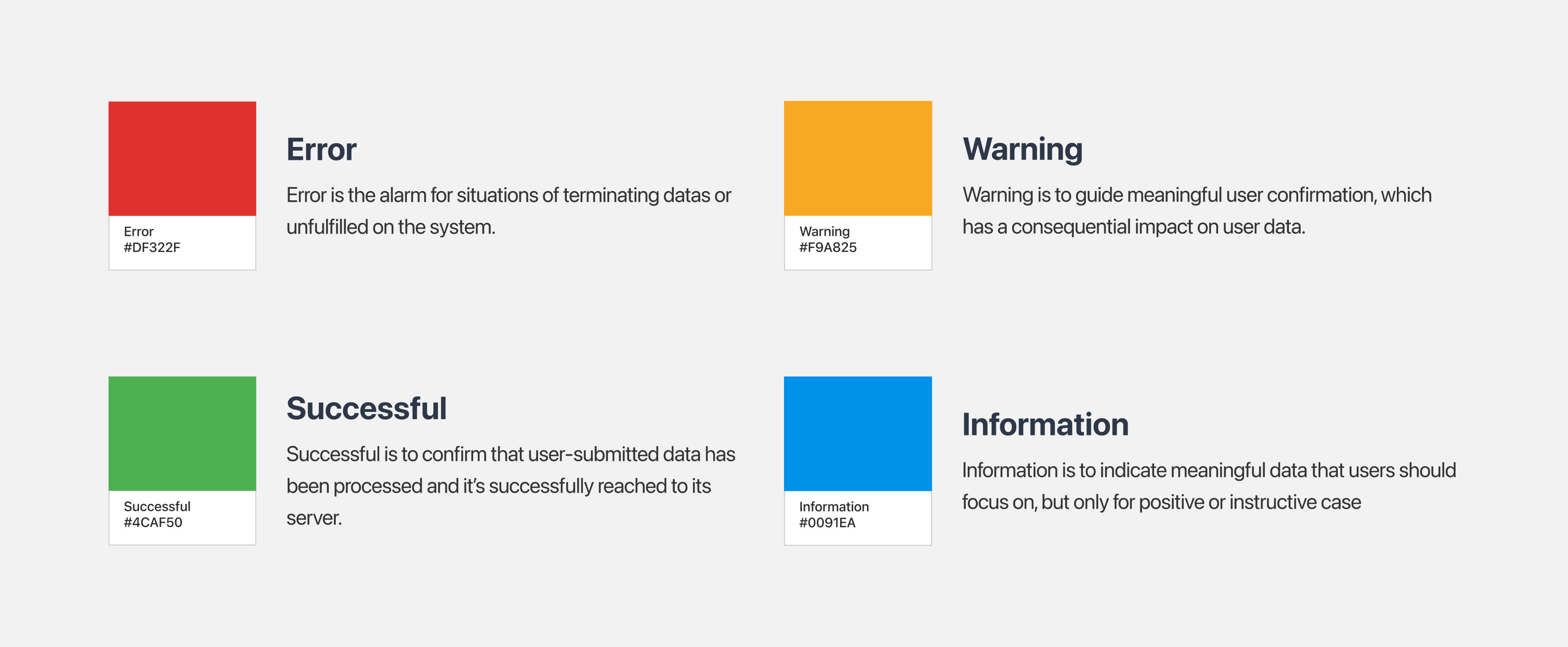
Badge is the display component, delivering statement or additional informations on the services. To show clear data, It should follow the Web Accessability rule.
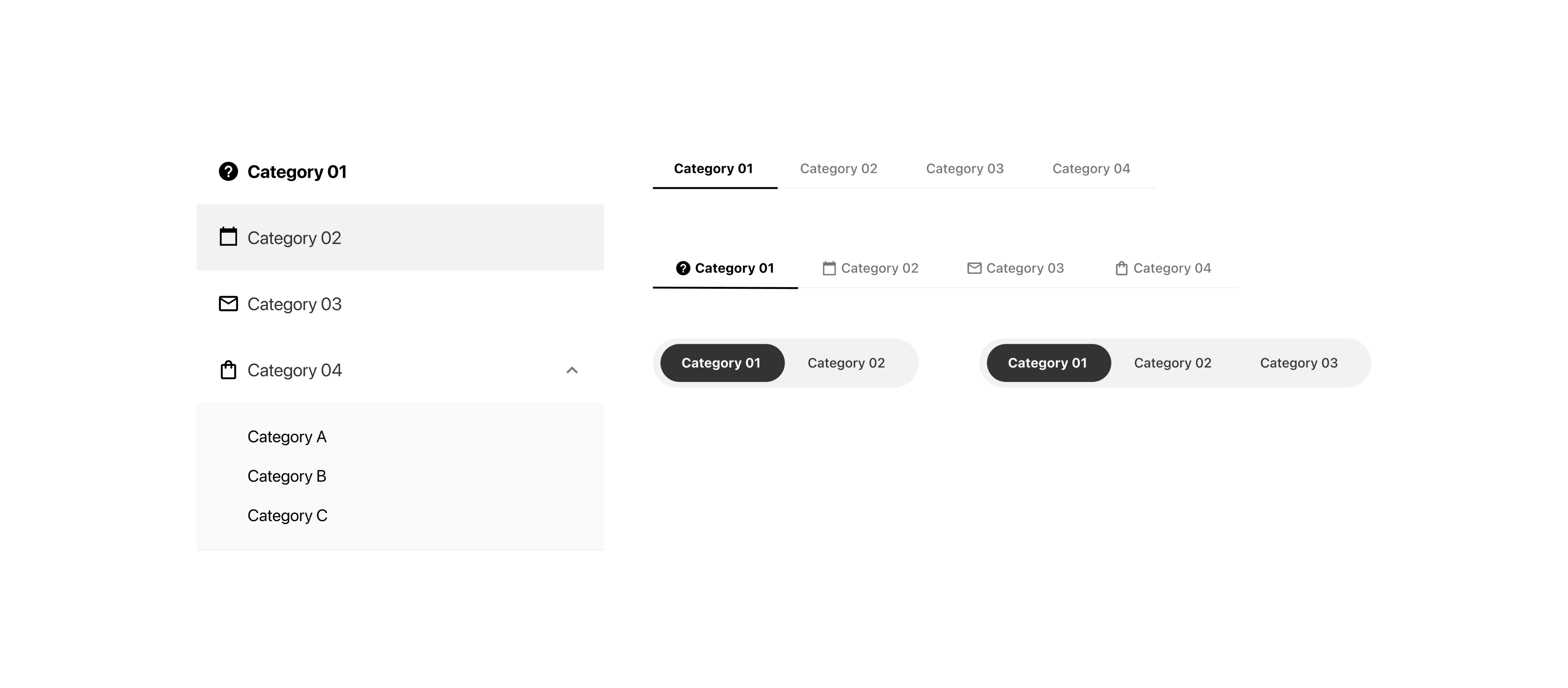
tab
Tab is for an indicator component that divides according to the domain or the main feature of each page.
Step 03. Usage
how to utilize it?
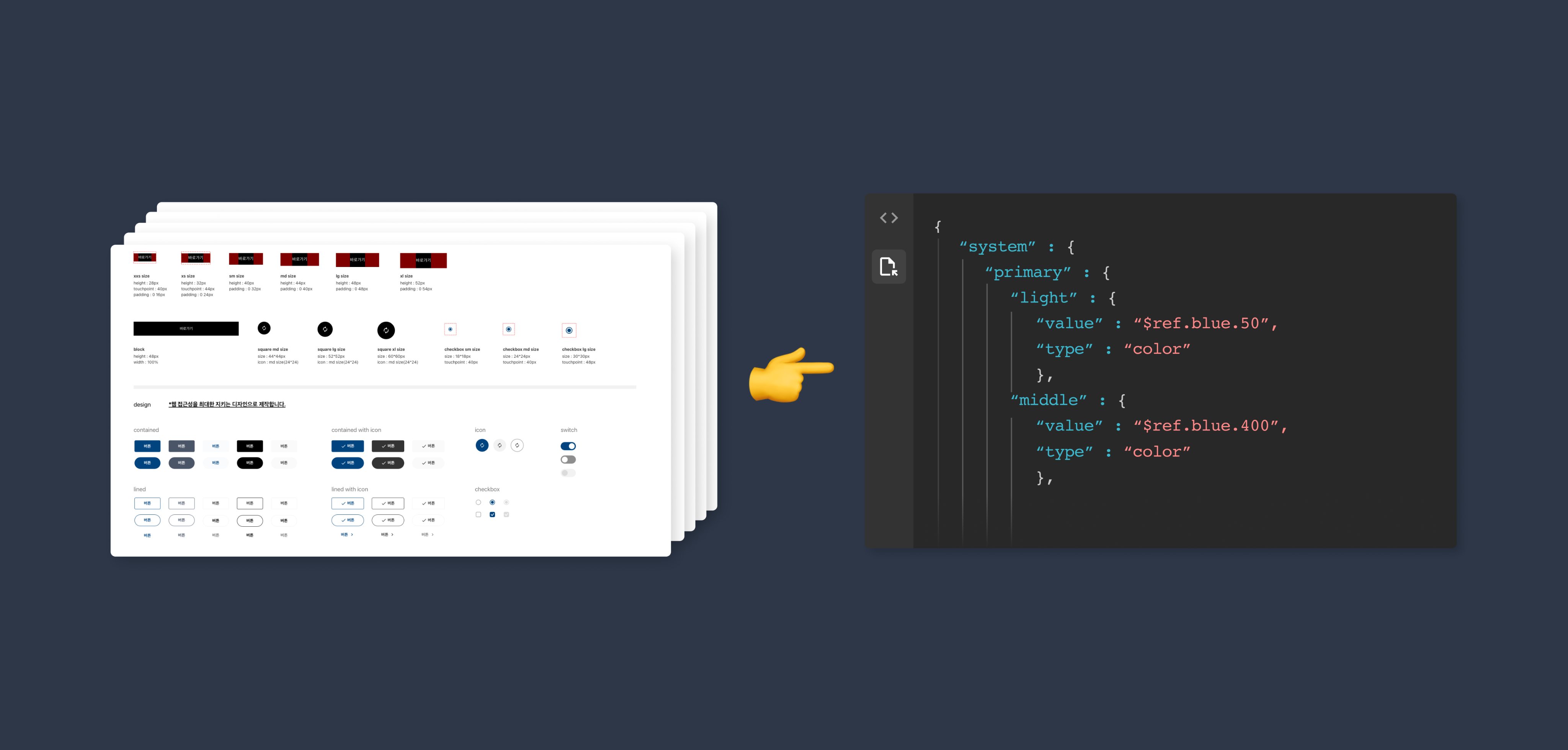
Since our team didn’t use Figma yet at that time, this style guide was set on the Sketch App.
The features that we used were Appearance and Color Variable(the same features of Styles on Figma), which is for building fonts, color and layout as an Element.
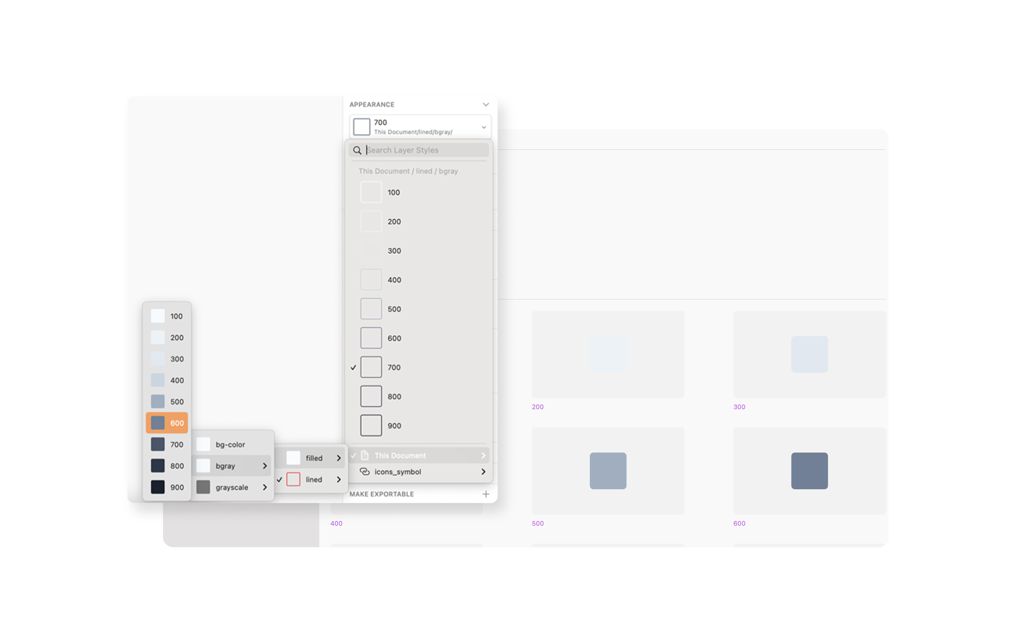
01 core value
We’ve set 2 styles, filled and lined. And also set each styles as a number to adjust on codes(CSS) and make these modify, when we need another color system
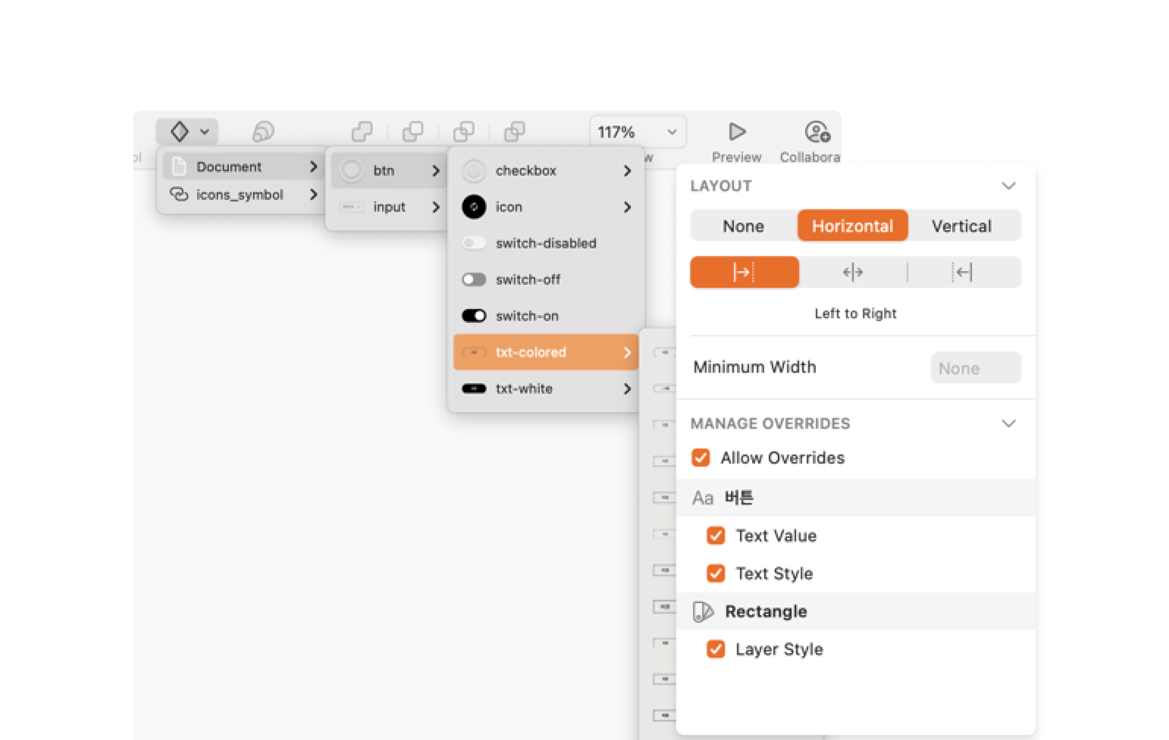
02 layout
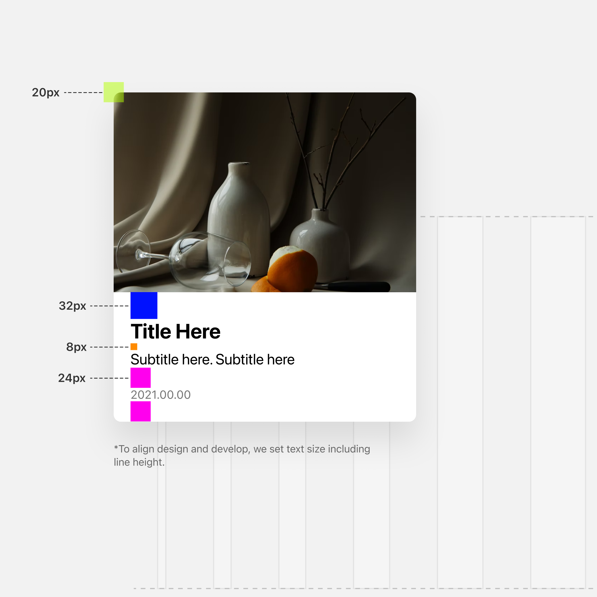
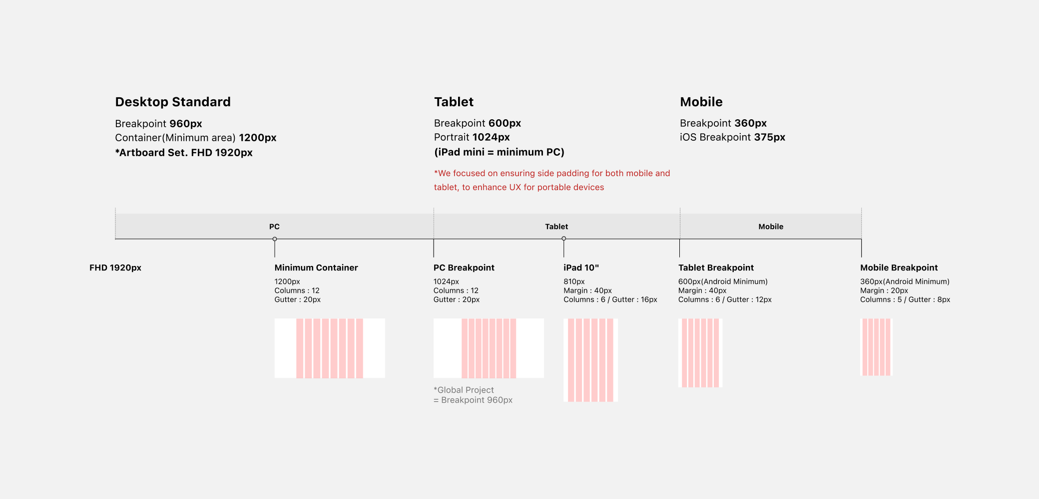
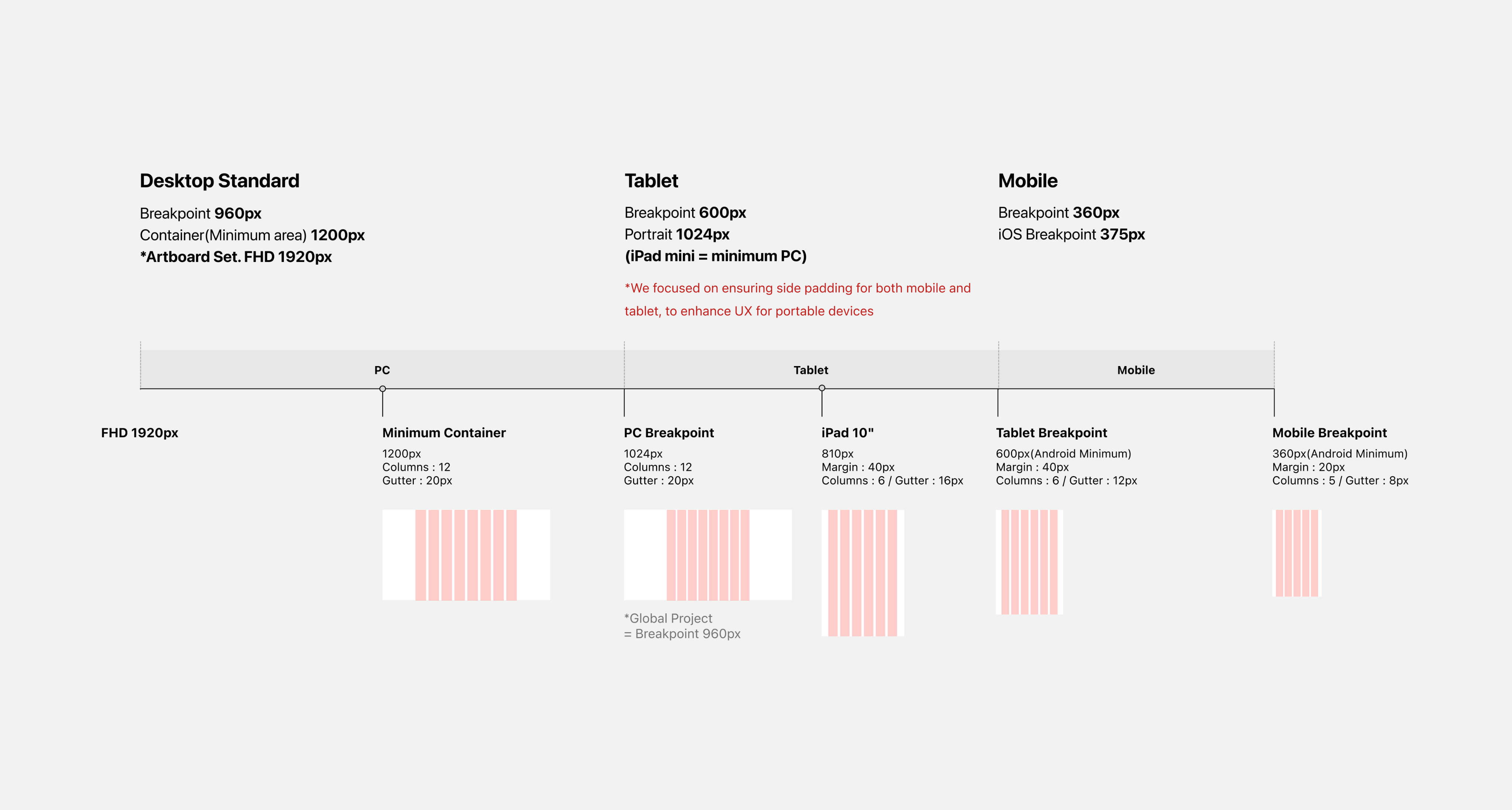
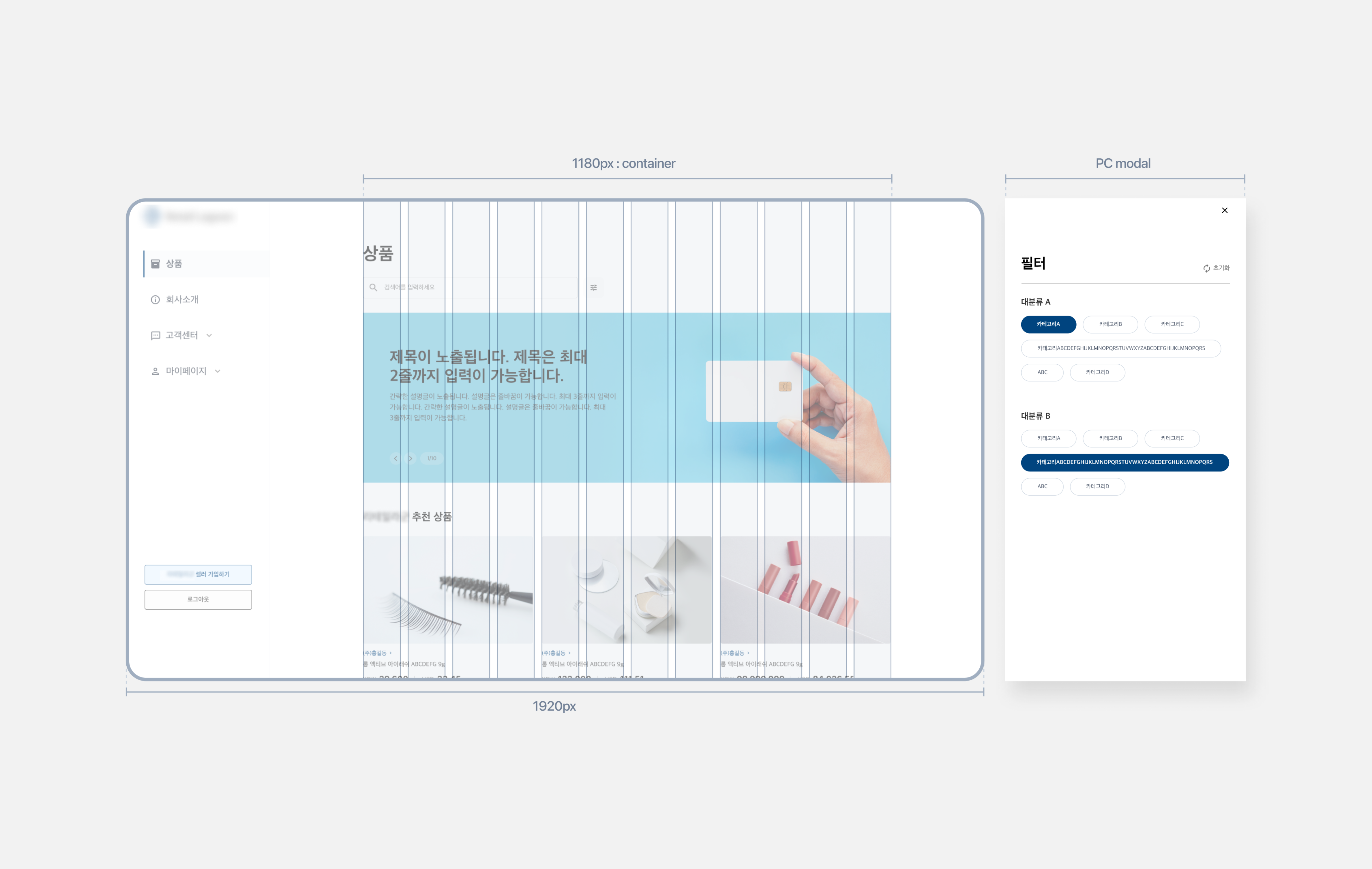
We’ve also set layout features for responsible design. Clients offered us a responsible setting in general, So It’s essential for our team. So we set this feature with “Layout” on each components

adjusting
into an actual project
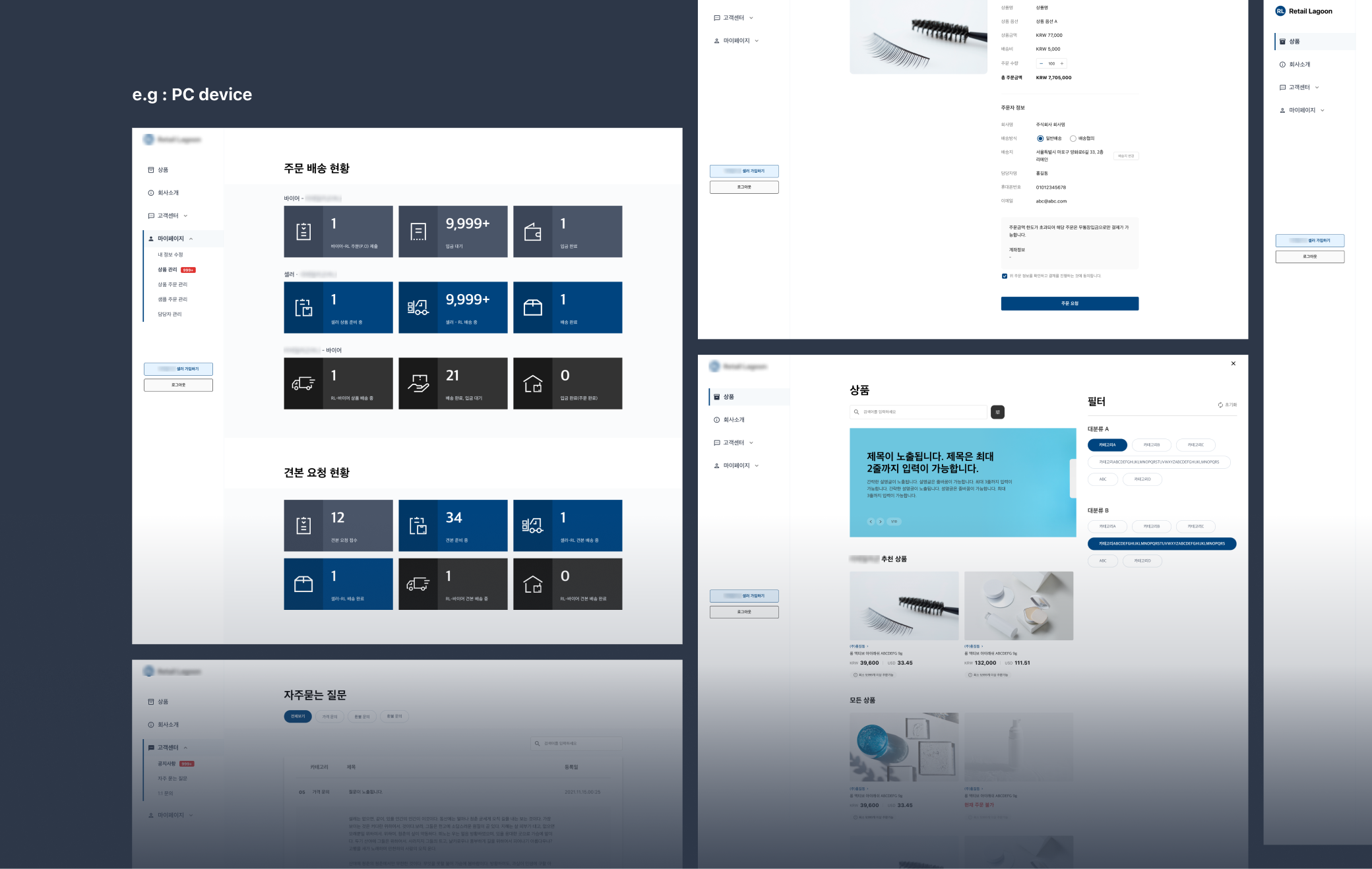
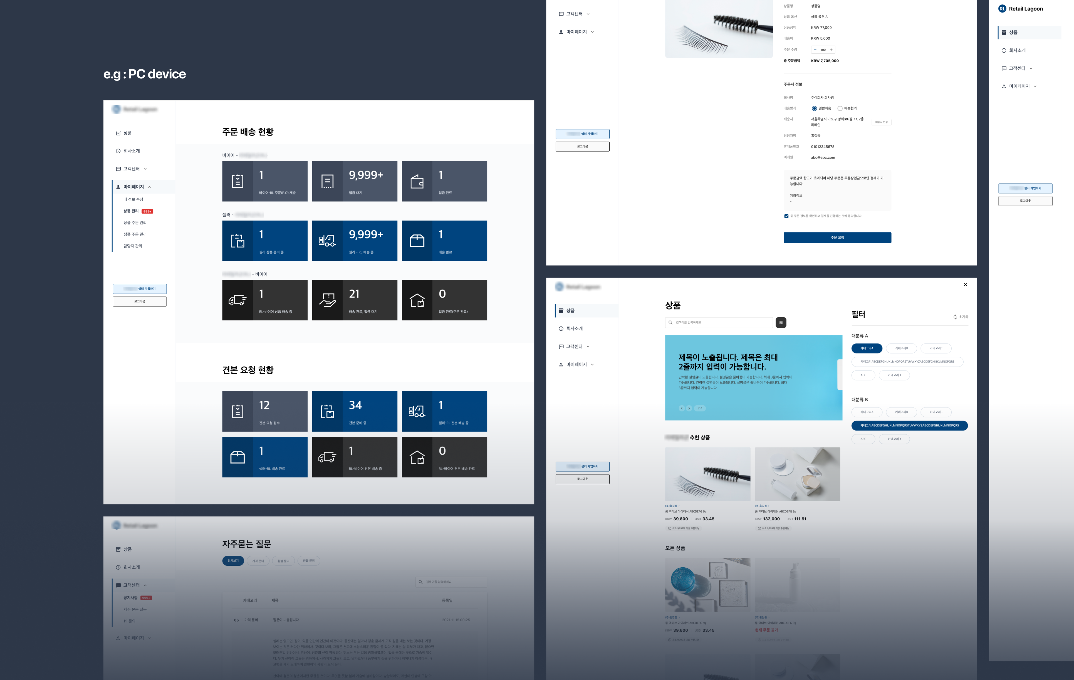
The first application was realizing it into a dashboard project, which is requiring making consistent frame-like pages. We developed the fundamental guide file, reflecting brand’s features(e.g. color, font).
We needed to make responsible web for every devices, including the brand’s own tablet device. We was able to practice based in essential idea of setting consistent margin&space that we’d set in Elements.
Result : What we achieved
What we achieved
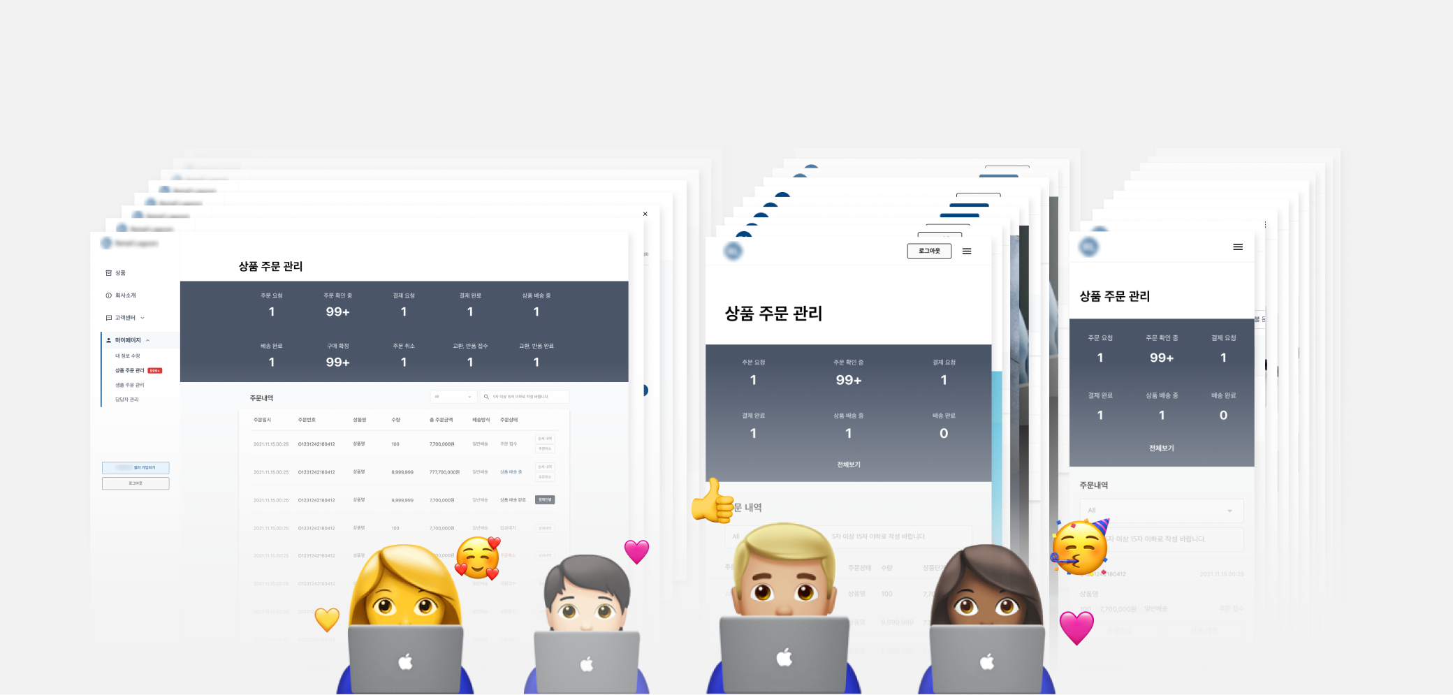
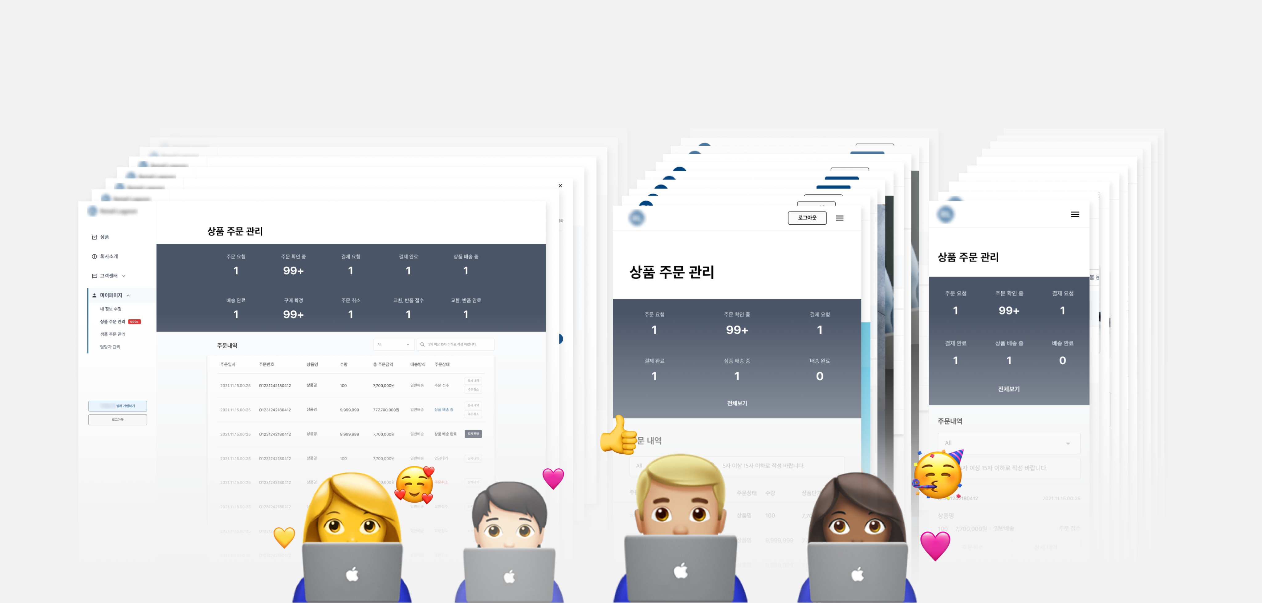
In the conclusion, we could finish about 200 pages amount of task within 7 working days. Although we had unexpected revising, which is involving a lot of changes in policy, the modifying tasks weren’t over 2 working days in total.
Not only the working efficiency, the aligned-idea could reach to our clients since the guide displayed the consistency on the pages.
what’s next?
I’ve learned how to improve working efficiency and communicate with stakeholders, but not able to make the code-based actual system. The following step for the design system was making the genuine design system. Therefore, I could experience it in the in-house startup company.
Ⓒ 2026 Imseon Kwon
RemainCo., Ltd
- Unified Style Guide for Designers
Overview
At a web agency, It’s essential to handle multiple tasks on a tight schedule. This project established a unified style guide to ensure consistent work across all projects.
contribution
I was charged in a lead designer on the project. To improve working efficiency, I proposed and led the creation of a unified component file in Sketch App — building a reusable component structure with the team.

Initial Thought

pain point
01
Deadline was always too tight.
02
There’re several repeated components on projects.
03
Communicating with software engineers was essential.
what we Have?
Since we’ve run a creative academy, we had an educational system study document.
- All of the team members were aware of this documents.
- The document was a theoretical document, so It had not been used in a practical way ever.
Step 00. Foundation
THE APPROACH
To address the pain points of inconsistent interfaces and inefficient team workflow, we adopted a token-based design system approach.
- All designers could work with the same predefined values, eliminating inconsistencies.
- Developers could easily translate design specs into a reusable UI component library.
- The team could scale design output without sacrificing quality or coherence.
idea
Element
Element is the smallest atomic unit to build a page such as Font, Color, and Spacing. Think of it as preparing the basic ingredients before cooking.
Component
Component is a module built by combining two or more elements. Just as ingredients come together to create a dish, elements combine to form reusable interface components that the entire team can rely on.

Step 01. Element
Step 02. Component
what components
we’ve set?
We built the component library by selecting recurring interface elements from previous project and consolidating them into a reusable shared framework.

button
We distilled the 3 most common button patterns from past work into reusable CTA-focused components, built with Sketch symbols and layer styles for quick project adaptation.
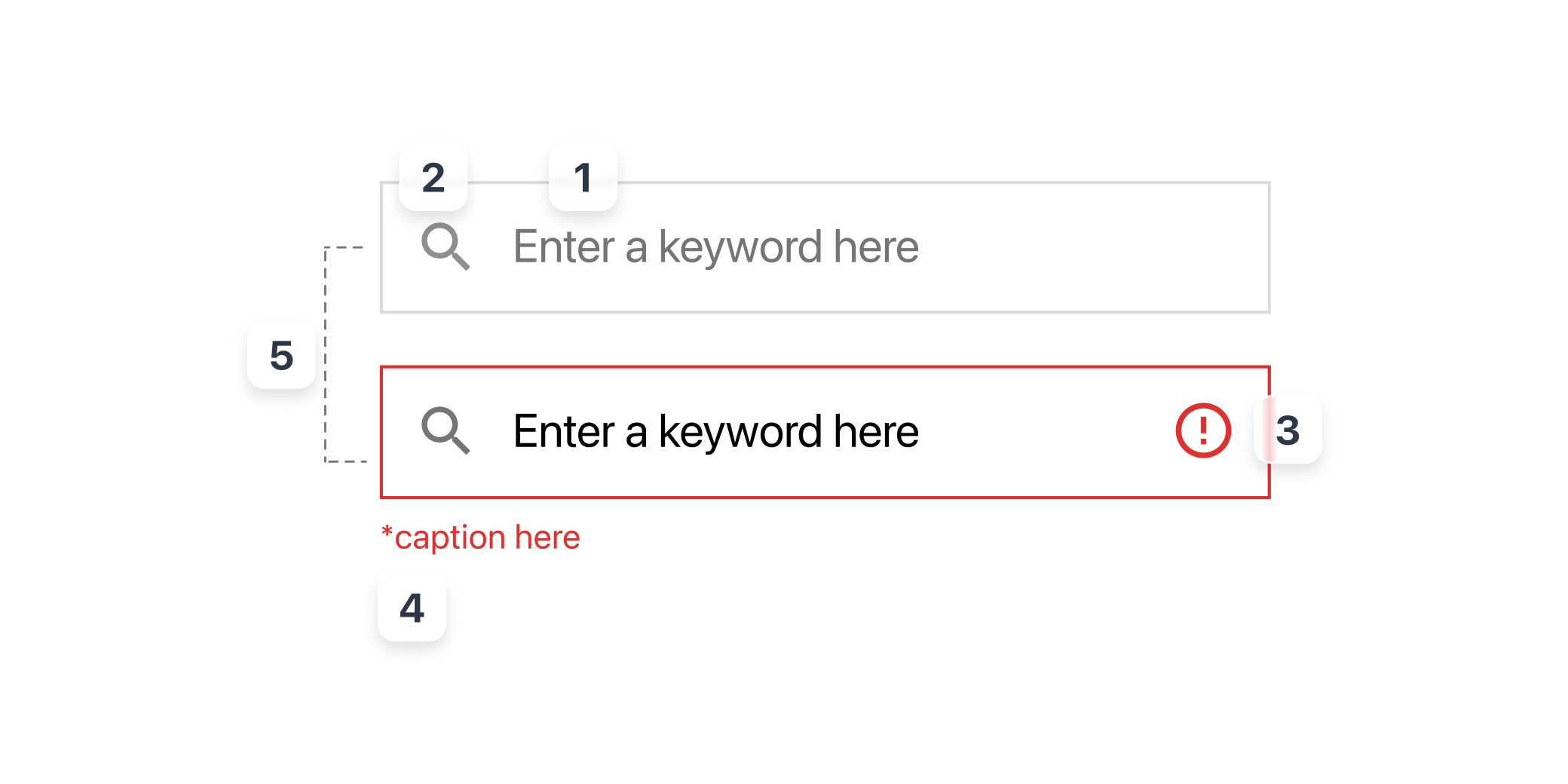
input
Input was also the most important and common interface in a service. We built a flexible input system covering diverse data entry scenarios, structured with Sketch symbols and layer styles for quick adaptation and consistent styling across projects.
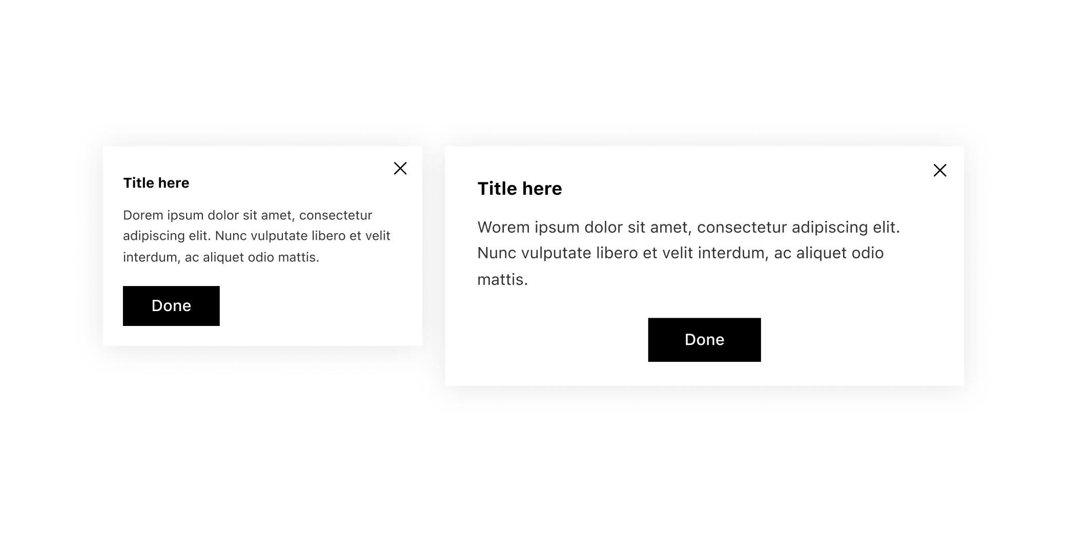
pop up
Pop-up has a specific behavior, modality. It’s delivering crucial and highlighted messages for users. The point of Pop up is stacked on Z-axis, to be distinguished to a page that comes from.
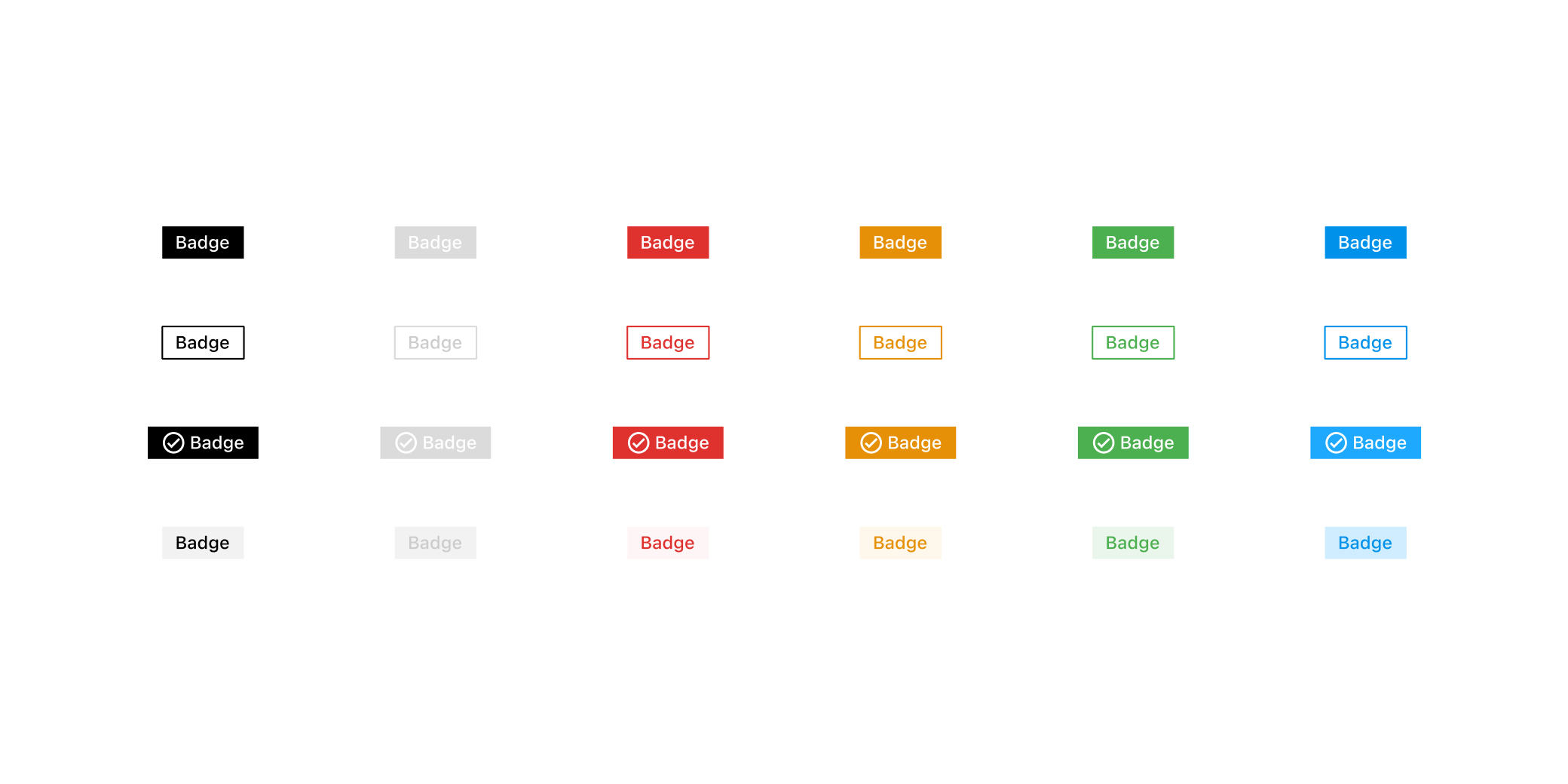
Badge
Badge is the display component, delivering statement or additional informations on the services. To show clear data, It should follow the Web Accessability rule.
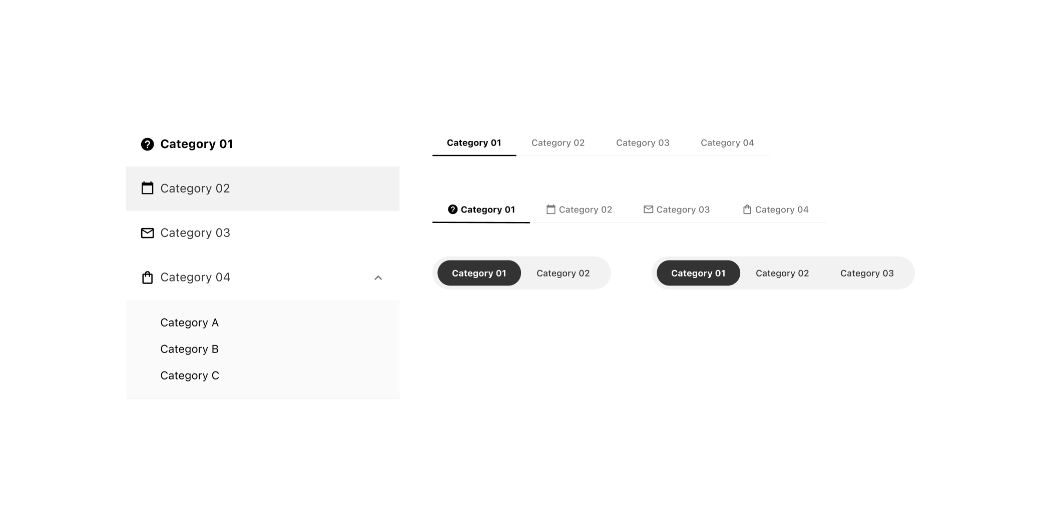
tab
Tab is for an indicator component that divides according to the domain or the main feature of each page.
Step 03. Usage
how to utilize it?
Since our team didn’t use Figma yet at that time, this style guide was set on the Sketch App.
The features that we used were Appearance and Color Variable(the same features of Styles on Figma), which is for building fonts, color and layout as an Element.
01
core value
We’ve set 2 styles, filled and lined. And also set each styles as a number to adjust on codes(CSS) and make these modify, when we need another color system
02
layout
We’ve also set layout features for responsible design. Clients offered us a responsible setting in general, So It’s essential for our team. So we set this feature with “Layout” on each components
Adjusting
into an actual
project
The first application was realizing it into a dashboard project, which is requiring making consistent frame-like pages. We developed the fundamental guide file, reflecting brand’s features(e.g. color, font).
We needed to make responsible web for every devices, including the brand’s own tablet device. We was able to practice based in essential idea of setting consistent margin&space that we’d set in Elements.
Result : What we achieved
what we
achieved
In the conclusion, we could finish about 200 pages amount of task within 7 working days. Although we had unexpected revising, which is involving a lot of changes in policy, the modifying tasks weren’t over 2 working days in total.
Not only the working efficiency, the aligned-idea could reach to our clients since the guide displayed the consistency on the pages.
what’s
next?
I’ve learned how to improve working efficiency and communicate with stakeholders, but not able to make the code-based actual system. The following step for the design system was making the genuine design system. Therefore, I could experience it in the in-house startup company.
Ⓒ 2026 Imseon Kwon